
Preview Email in iPad Mail
Send a campaign to MailSlurp and preview it in iPad Mail. Inspect the wider layout, service columns, photo and booking action, with a matching iPhone comparison.

Once a campaign has a desktop approval and a phone approval, it is tempting to call the iPad covered too. But a tablet gives the offer another reading area: a headline may fit on one line, the service descriptions may share a row, and the photograph may sit inside generous margins.
MailSlurp's iPadOS Mail target shows the email in Apple's Mail app on iPad. We'll send a fictional ClearRoof campaign to a render address and inspect that tablet result. Its two service descriptions stay side by side, while the matching iPhone Mail result stacks them. Both deserve a read before the campaign goes out.
Why give iPad Mail its own check?
More room can make an offer easier to scan, but it also changes the distance between the photo, explanation and action. Look at how the message uses that room. A comfortable headline does not tell you whether the smaller conditions are easy to read farther down.
The Apple Mail family guide explains the Mac, iPhone and iPad targets. Use the tablet result to inspect the actual Mail view shown, and compare it with the phone when the same campaign reaches both audiences.
Manual testing means finding a tablet, sending the latest revision to it and capturing the whole body again after an edit. Add phone and desktop checks and keeping those versions aligned becomes a job of its own. MailSlurp collects the selected renders from your campaign so the team can review matching results together.
Step-by-step guide: preview email in iPad Mail
You'll need a MailSlurp workspace with device previews available and enough preview credits for the selected target. We tested iPadOS Mail, the native Mail app on iPad, on October 9, 2026 (NZDT).
The ClearRoof sample is a fictional gutter-care offer with a hosted photograph, two service descriptions, a starting price of $160 + GST and a booking action. We use the complete email, including the conditions and footer.
1. Select iPadOS Mail
Open the new device preview form, or choose Start new render from Device previews.
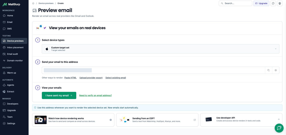
Expand Custom target set, select iPadOS Mail and confirm 1 target selected for this individual check. Make sure a saved profile has not added other clients.
Choose the tablet by its full name. iOS Mail is the iPhone target, and Apple Mail on macOS is the desktop app.
2. Copy the tablet render address
Choose Send email, then copy the current address under Send your email to this address. Check it against the recipient field in your sending tool before sending.
Copy it after selecting iPadOS Mail, so the campaign goes to the target set you intend to review. Use the address in your own workspace, rather than one from an old test.
3. Send the campaign and follow the run
Send the campaign or test message to that address. If you use an email platform, its test-send option lets you inspect the message it produces, including any changes to personalization or links.
This sample uses the subject Before the next downpour: gutter care from $160 + GST. A downloadable sample email contains the design, hosted photograph URL and example links. Keep the source unchanged when you compare it with the phone result.
In MailSlurp, choose I have sent my email to open the waiting view. Receipt starts the render automatically. The matching campaign appeared with RUN CREATED; View results opened its run.
Wait for COMPLETE and a READY iPadOS Mail result. This run finished with one ready screenshot. If receipt or rendering is still pending, inspect the existing message and run before sending another copy.
4. Inspect the photo, text width and booking action
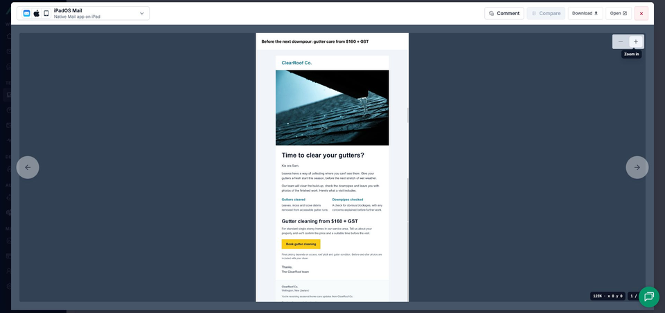
Open the completed screenshot. The viewer identifies iPadOS Mail and Native Mail app on iPad. Use the zoom controls to inspect the composition or smaller details; Open displays the full image separately.
Start with where the email sits inside Mail. Follow the photograph into the headline and introduction, then read both service descriptions. Check whether each paragraph is easy to follow across its available width before moving to the price and button.
How did the campaign fit the iPad reading area?
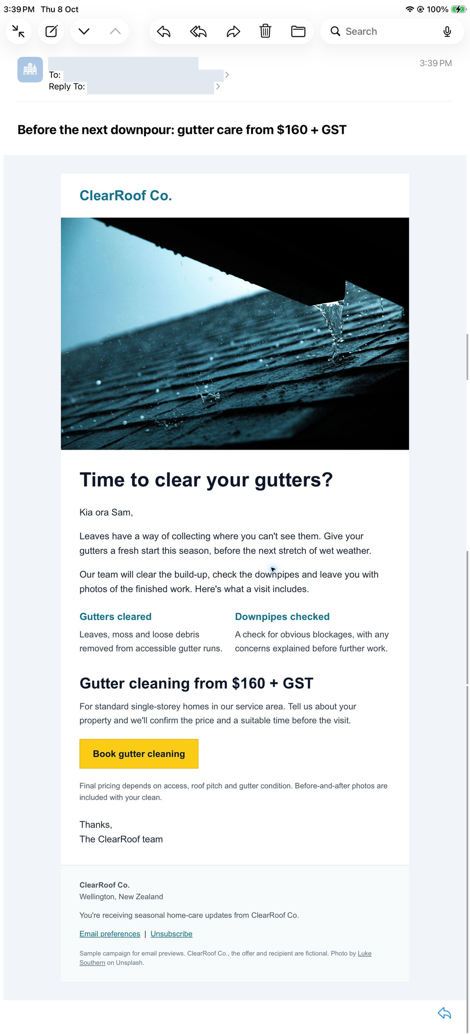
The white email sits in the center of a pale surround, with visible space on each side. The gutter photograph fills the width of that email panel, rather than stretching across the whole Mail view. The source uses a 600px content table; the screenshot shows how the complete design occupies this captured reading area.
Time to clear your gutters? fits on one line. The introduction has longer lines than in the phone result, and Gutters cleared and Downpipes checked remain side by side. Each service heading fits on one line, with its explanation beneath it. The two descriptions can be read together before moving to the offer.
Gutter cleaning from $160 + GST also fits on one line. The yellow Book gutter cleaning button retains a dark label and sits below the service-area explanation. The conditions and signoff follow, with company details, preferences, unsubscribe, the fictional-sample notice and photo credit present in the complete footer.
If you add another service or replace the photo with a taller image, inspect how far the price and action move from the explanation. A neat top section is only part of the message.
What changes between iPad Mail and iPhone Mail?
The iPhone Mail walkthrough uses the same ClearRoof campaign and photograph, rendered on the same day. On the phone, the service descriptions stack, the main heading takes two lines and the price breaks before + GST. On the tablet, the two descriptions share a row and both larger headings fit on one line.
The content stays in the same order, but the reading pace changes. The phone takes you through one service at a time; the tablet lets you glance across both. Check that the offer remains understandable in each arrangement before shortening copy or moving sections to suit one view.
If you revise width or padding, repeat both checks. The email design-size guide explains template width, image dimensions and HTML weight, which helps when deciding what to change.
What if a customer's Mail view looks different?
Ask for the app view as well as the email. Apple's iPad window guide describes resizing and arranging app windows. That context can matter when investigating a report about cramped text or unexpected wrapping.
This result shows the iPadOS Mail view captured in the run. When a customer's screenshot shows a different window arrangement, compare the available reading area as well as the email before attributing a difference to the template.
For the short text shown in your own Mail inbox, Apple's Mail instructions explain the message-list Preview setting. The campaign check here follows the complete opened message through its footer.
MailSlurp features for tablet review and team approval
Send a test email to a render address to inspect the output from your sending platform. Template HTML and exported-message imports also help with an earlier design or an existing campaign. The source guide explains how to choose the message you want to check.
Save a target profile for routine reviews, including iPadOS Mail when tablet customers matter. MailSlurp's review tools support client-specific comments and share links. Point a colleague to the whole result and name the text or spacing that needs attention, so they can see how it relates to the rest of the offer.
For application-generated messages, the rendering API in CI can retain screenshots alongside the email produced by a test. That keeps the design review connected to the revision being released.
Which other devices belong in the review?
Pair iPadOS Mail with iOS Mail and Apple Mail on macOS when your audience spans Apple's devices. Add Gmail iOS and Outlook iOS for those phone apps, then the Android, desktop or webmail clients your customers use.
| Device | Email app | Appearance |
|---|---|---|
| Android phones | Gmail, Outlook | Light and dark |
| iPhone | Gmail, Apple Mail, Outlook | Default |
| iPad | Apple Mail | Default |
| Mac | Apple Mail | Default |
| Windows | New Outlook, Outlook Classic | Default |
| Webmail | Gmail | Light and dark |
| Webmail | Outlook.com, Yahoo Mail | Default |
Choose the available clients and modes in your workspace when starting a preview. Test the apps your customers use, including dark mode where it is offered.
Use the same message across those selections. The Apple Mail family guide helps choose the Apple targets; the completed tablet result remains a separate check from the phone and desktop.
Is the offer still easy to find after the photo?
The photograph sets the scene, but the service descriptions and starting price give a customer a reason to continue. On the tablet, check that the wider composition helps those details read together and leads naturally to the booking action. Give the quieter conditions the same attention as the headline.
Once the presentation is ready, check the real campaign's booking destination from a controlled message. This sample uses example links. A clear offer and the right next page leave fewer obstacles between an interested reader and a booking.