










How to Preview Email in Apple Mail on Mac, iPhone and iPad
Catch layout and image problems across Apple devices before you send. Use MailSlurp to compare the same email on Mac, iPhone and iPad.
Use with your tools
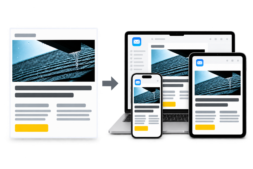
How does your email look when someone opens it in Apple Mail on a Mac, then reads it on their phone? A useful preview compares how the same HTML email renders on Mac, iPhone and iPad, so you can see whether its layout adapts and its content stays readable.
The available reading space changes between these devices. Text can wrap and columns can move even within Apple's Mail apps, so a desktop check leaves the phone layout still to review.
You can send a test to devices you own. That means keeping their mailboxes ready, opening the latest message in each app and collecting the views you want to compare. After an edit, you repeat the round and make sure anyone reviewing the screenshots is looking at that revision.
MailSlurp is an email testing platform that brings device previews into one place. Its rendering tools help you compare an email across Apple devices and keep the review focused on the same message, without collecting each screenshot by hand.
How automated device rendering works
Choose the devices and email services you want to test, and MailSlurp gives you a special email address. Send your campaign to that address. MailSlurp opens the email in the selected apps and webmail services, then captures screenshots automatically.
The screenshots come back together, ready to compare across phones, tablets and computers. Check the layout, images and buttons, then share a result link so your team can review the same version of the email.
Let's test an example email
We'll use a simple example with a heading, two logos, two columns of text and a blue button. The columns are designed to sit side by side on a wide screen and stack on a phone. In each view, the heading should remain readable without running into a logo.
This example contains diagnostic labels to help identify the layout changes. All three Apple results below come from the same imported .eml file; the linked device walkthroughs use a fictional ClearRoof campaign instead.
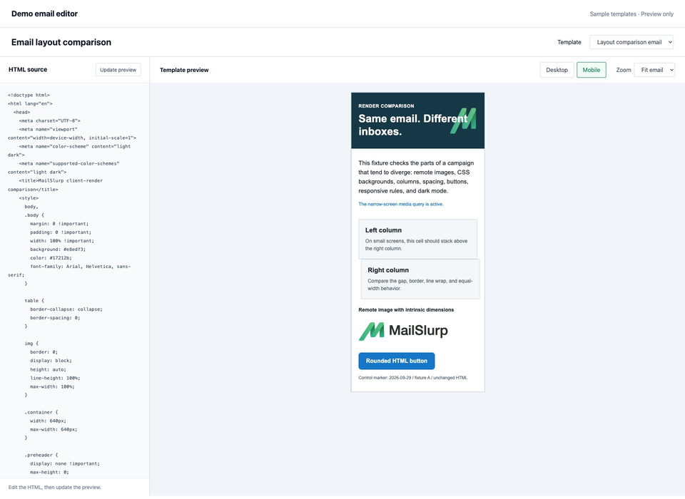
The mobile browser preview already shows the heading reaching the green logo. When we open the email in Apple Mail, we'll check both the column layout and that crowded heading.
Preview one email across Apple devices
You'll need device previews available in your MailSlurp workspace and enough credits for the selected targets.
Mail on a Mac, iPhone and iPad has a separate target in MailSlurp. Gmail and Outlook on iPhone are separate again: select Gmail iOS or Outlook iOS for those apps.
| Where the email is read | MailSlurp target | Detailed campaign walkthrough |
|---|---|---|
| Mail on a Mac | Apple Mail | Preview email in Apple Mail on Mac |
| Mail on an iPhone | iOS Mail | Preview email in iPhone Mail |
| Mail on an iPad | iPadOS Mail | Preview email in iPad Mail |
- Open the new device preview form, or choose Start new render from Device previews.
- Expand Custom target set and select the Apple targets you need. Check the selection count, any saved profile and the displayed credits before continuing.
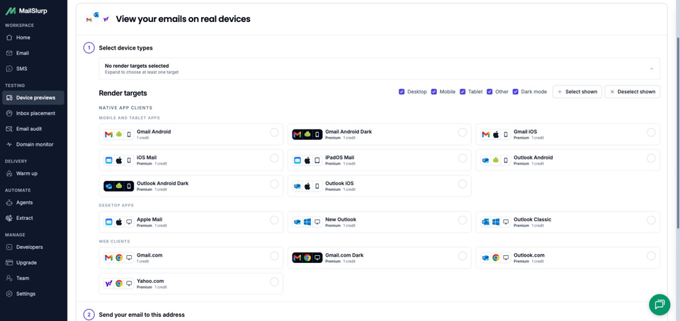
- Choose Send email, then copy the address under Send your email to this address. Copy it after selecting your targets and check the recipient in your sending tool.
- Send your campaign or test message to that address. If you use an email platform's test-send option, check which recipient data it uses for personalization.
- Choose I have sent my email to open the waiting view. The email's arrival triggers rendering automatically. Find the matching subject with RUN CREATED, then choose View results.
- Wait for the run to finish and each selected result to show READY. Open each screenshot at full size, check the app name and compare the same sections across devices.
If a result is still pending, check the received message and existing run before sending another copy.
For a saved email or a template you're editing, use HTML, exported-email and stored-message imports. The steps above describe the send-email workflow used in the linked campaign walkthroughs. To test a button destination as well as its appearance, open a copy of your test email on a device and tap it.
Compare the desktop and tablet previews
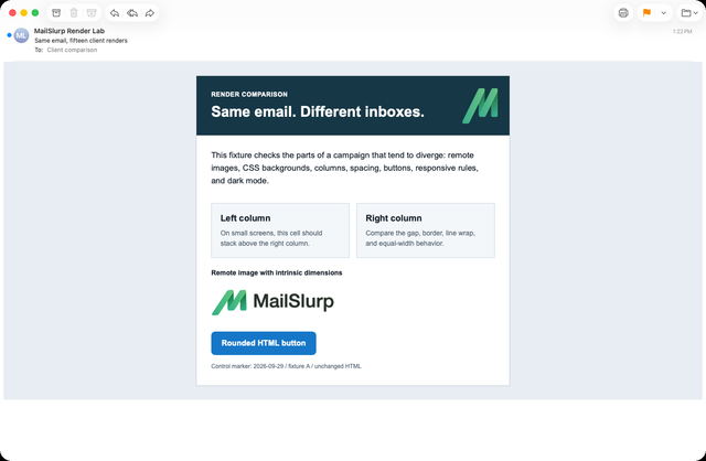
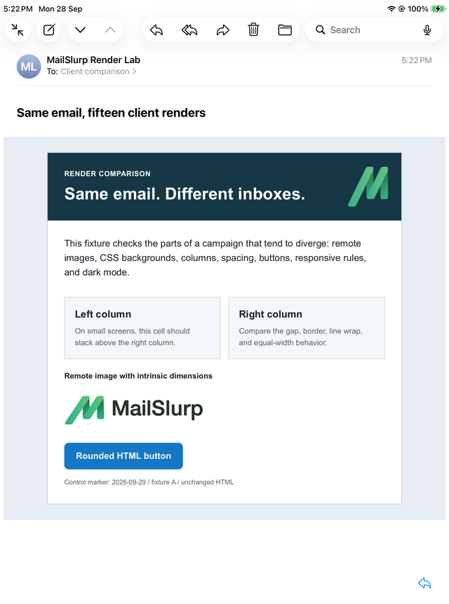
Start with the wider views. In this example, Mac and iPad keep the two columns side by side, with the heading clear of the background logo. Both logos and the blue button are visible. These views show the intended wide layout; next, check what changes when the email has less room.
Apple Mail on macOS
Mail on iPad
Now check the same email on iPhone
On iPhone, the columns stack and the button widens. That is the expected layout change, but the heading still reaches into the background logo's area. The comparison gives us a specific issue to address before sending, even though the wider versions look comfortable.
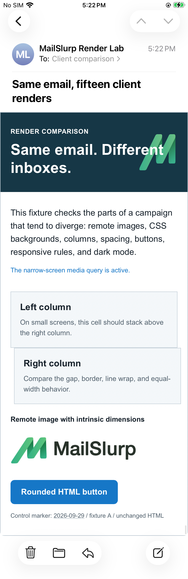
The stacked blocks also start at slightly different positions. Both this offset and the crowded heading appear in the mobile browser preview too. If your email has a similar issue, inspect the space around the logo and the padding on the stacked cells, then preview the change on all three devices. These screenshots show the original email; a repair still needs its own test.
Recheck the layout after editing
Use the copy you intend to send when repeating the check, including longer recipient names or translations. Read wrapped text for clipping, overlap and awkward gaps. This example uses system fonts; if your template uses a custom font, inspect its fallback too, since different character widths can change the line breaks.
Use a comment or share link to point a colleague to the crowded heading in the iPhone result.
Keep Gmail and Outlook in the comparison when readers use them
Three Apple devices still leave other apps unchecked. The iPhone Mail campaign guide compares the same ClearRoof email with Gmail on iPhone: Apple Mail stacks its services, while Gmail keeps them side by side. Add the mobile, desktop and webmail clients your recipients use, and save them as a target profile for the next revision.
Mobile and desktop each account for a substantial share of tracked web traffic. Statcounter's September 2026 figures put mobile at 55.41% in Europe and 49.10% in the United States. Desktop, including laptops, accounts for 42.32% and 48.47%, and tablets for 2.27% and 2.42%. These are web pageviews across platforms, not email opens or Apple Mail use. Sources: Europe and the United States.
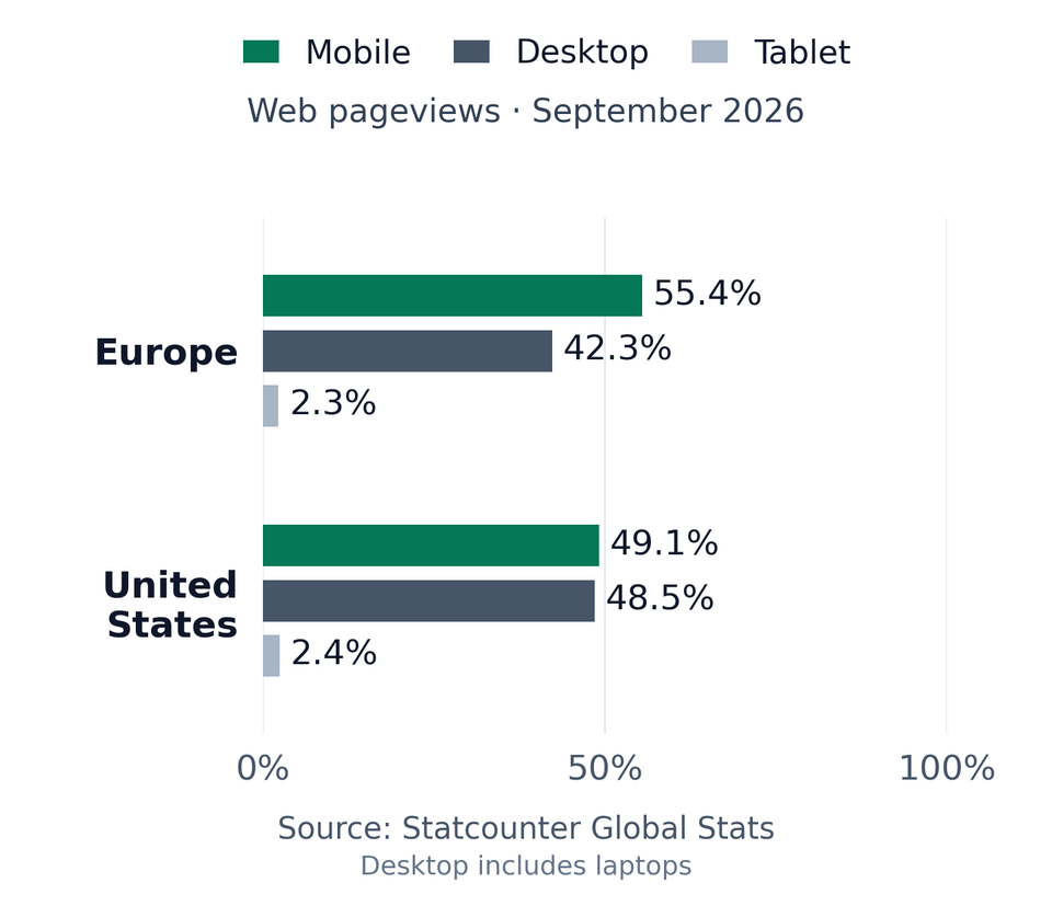
Chart redrawn from the linked Statcounter Global Stats data under CC BY-SA 3.0.
| Device | Email app | Appearance |
|---|---|---|
| Android phones | Gmail, Outlook | Light and dark |
| iPhone | Gmail, Apple Mail, Outlook | Default |
| iPad | Apple Mail | Default |
| Mac | Apple Mail | Default |
| Windows | New Outlook, Outlook Classic | Default |
| Webmail | Gmail | Light and dark |
| Webmail | Outlook.com, Yahoo Mail | Default |
Choose the available clients and modes in your workspace when starting a preview. Test the apps your customers use, including dark mode where it is offered.
To compare the same email on other apps and devices, send a test to the free email render and review the screenshots side by side.