
guides
How to preview an email in Gmail
Preview the same delivered email in Gmail web, web dark mode, Android light and dark mode, and Gmail on iPhone before sending.
A Gmail preview is not one screenshot. The browser, Android app, iPhone app, and dark-mode variants can make different decisions about the same delivered HTML.
On September 29, 2026, we sent one controlled .eml through every current MailSlurp Gmail target. The fixture included a hidden preheader, a CSS background image, a two-column table, a remote transparent wordmark, a rounded HTML button, a narrow-screen media query, and dark-mode CSS. The results below are the unedited target screenshots.
Choose the Gmail surface you need
- Gmail on the web for the light browser experience.
- Gmail web in dark mode for dark Gmail chrome around the message.
- Gmail on Android for the light Android app.
- Gmail on Android in dark mode for the dark Android app.
- Gmail on iOS for the Gmail app on an iPhone.
Start from audience evidence when you have it. Otherwise, web plus Android light/dark and iOS gives a useful first pass for a campaign whose mobile share is unknown.
Gmail web light and dark kept the message surface light
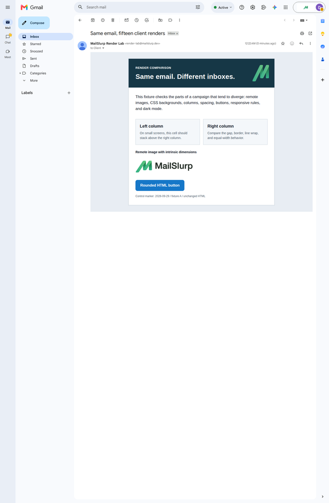
The controlled web renders kept the content card light in both targets. The dark target changed Gmail's surrounding interface, but it did not transform this particular message into the same dark treatment seen on Android.
Gmail web light
Gmail web dark
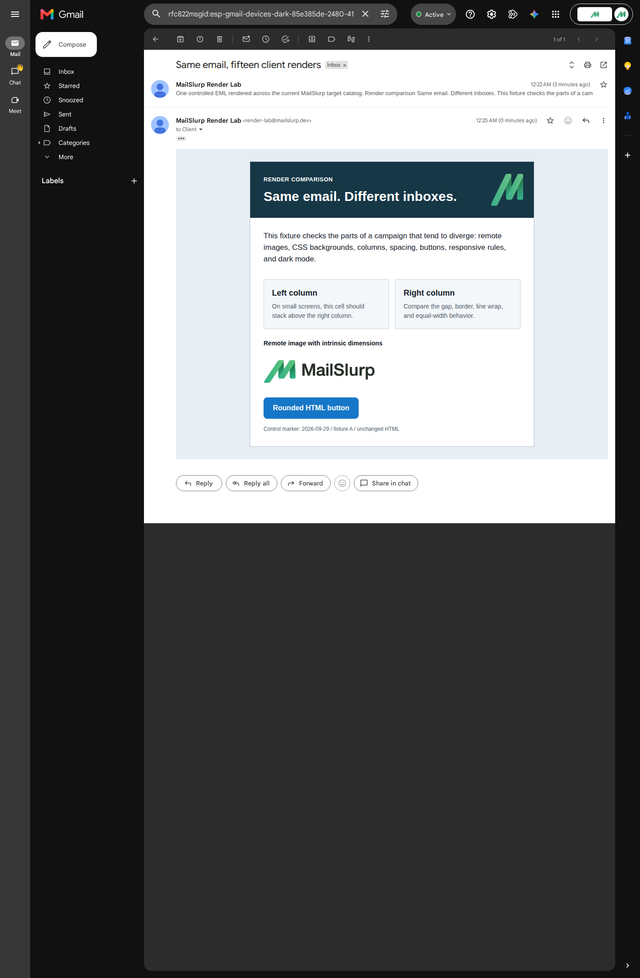
Both web targets kept the desktop columns, CSS background logo, remote wordmark, and styled CTA. That does not make the web render a substitute for the apps. It tells you this fixture passed those checks in these two web targets.
Google's maintained Gmail CSS support reference lists supported selectors, properties, and width-based media queries and notes that unsupported rules may be ignored. Use it while building the template, then use the delivered render as the acceptance check. A property appearing in a support list does not prove that the complete campaign behaves as intended in every Gmail app and mode.
Gmail Android exposed different failures
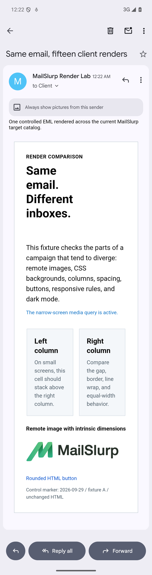
The Android app told a less comfortable and more useful story. In the light target, the hidden preheader became visible above the designed email. The narrow-screen marker appeared, but the two columns stayed beside each other. The hero lost its background treatment and the button became an ordinary link.
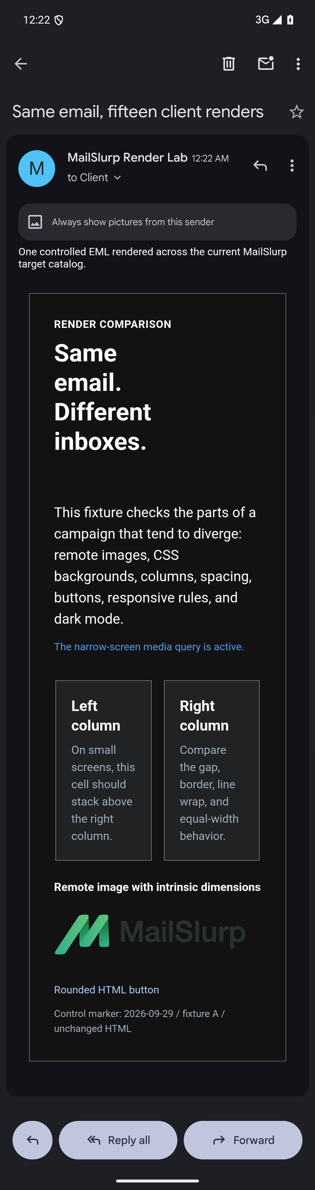
In the dark target, Gmail transformed the message surfaces and text. The dark wordmark inside the transparent image became difficult to read, while the green mark remained visible.
Gmail Android light
Gmail Android dark
The practical fixes are different for each symptom:
- Put critical colors, dimensions, and text styles inline instead of relying only on a
<style>block. - Make hidden preheader text harmless if a client exposes it. It should summarize the email, not contain spacer characters or internal notes.
- Keep the mobile reading order sensible even if a two-column layout does not stack as intended.
- Do not rely on border radius or a CSS class to make a link recognizable as the primary action.
- Test a transparent dark wordmark against transformed dark surfaces. An opaque or alternate asset may be safer.
The preheader repair guide shows the same exposed text removed in fresh Gmail Android and iOS renders. If the footer is cut off instead, use the Gmail clipping checks to inspect the delivered HTML size.
Do not change all five things at once. Repair the most consequential failure, send the complete email again, and compare the same target.
Gmail on iPhone was not the same as Gmail on Android
The iOS result also exposed the preheader and lost the hero background and button fill. The columns remained side by side, but their available width, text wrapping, and surrounding mail interface differed from Android.
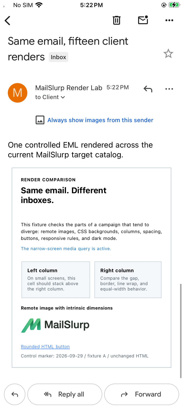
This is the reason to label screenshots with the app and operating system. "Mobile Gmail" hides the difference you need to reproduce.
Preview the delivered Gmail email
- Open the free render link for the target you want.
- Paste HTML for a quick check, upload an
.eml, or send the final email to the temporary render address. - For a campaign, use the ESP's real test-send path after the content, images, preview text, links, tracking, and footer are final.
- Inspect the complete result at full size.
- Compare light and dark mode where both targets are available.
- Record the message revision and exact target with any defect.
- Change one mechanism, resend, and keep the before-and-after result.
If the message came from an ESP, use its specific procedure when available: Mailchimp device rendering, Klaviyo device rendering, or HubSpot device rendering.
A Gmail preview checklist that finds real problems
Before you send the render
- Use the final subject and preheader.
- Include representative personalization, including long names and translated copy.
- Finish hosted images and tracking links.
- Include the real footer and unsubscribe content.
- Keep the message size under control and look for unexpected duplication in the delivered MIME.
In Gmail web
- Check the desktop content width and line length.
- Confirm remote images load at the intended dimensions.
- Inspect CTA fill, label contrast, and destination.
- Compare light and dark Gmail chrome without assuming the message body will transform.
In Gmail Android and iOS
- Look for exposed preheader text.
- Check whether columns stack, shrink, or remain side by side.
- Read the email without zooming and inspect the longest heading.
- Confirm the CTA still looks actionable and is easy to tap.
- Check transparent logos and icons against the actual rendered surface.
- Review the bottom of the message, not only the first phone screen.
In Gmail Android dark mode
- Check text, logo, button, link, divider, and image contrast separately.
- Look for client color transformations rather than judging only your declared dark CSS.
- Compare the light and dark screenshots from the same message revision.
What this test can and cannot prove
A device render proves how that delivered message appeared in that named target at the time of the run. It does not prove that every Gmail user has the same settings, that every future Gmail release behaves identically, or that the message will land in Primary rather than Promotions or Spam.
Rendering and placement answer different questions. Use inbox placement testing when the concern is where the message lands. Use the Gmail Promotions guide when the debate is Promotions versus Spam.
Frequently asked questions
Why does Gmail mobile look different from Gmail web?
They are different application and operating-system contexts with different available widths, style processing, image behavior, and dark-mode treatment. Test the actual app rather than shrinking a browser and calling it a phone preview.
Does Gmail support responsive email?
Responsive techniques can work, but a supported-looking rule is not the same as a passed campaign. The controlled Android and iOS renders above showed the narrow-screen marker while leaving the two columns side by side. Build a readable fallback and verify the delivered email.
Why did the hidden preheader appear?
The fixture hid it with CSS in the document head. In the mobile Gmail results, that treatment did not keep it hidden. Use a concise, customer-safe preheader and test the final MIME rather than assuming hidden layout text stays invisible.
Is Gmail dark mode the same on web and Android?
Not in this controlled run. Gmail web dark kept the email surface light, while Gmail Android dark transformed the message and exposed a wordmark contrast problem. Treat them as separate approval targets.
Approve the email customers will open
Gmail web may pass while Gmail on a phone reveals the problem that matters. Run the exact target, preserve the screenshot, and describe the failure in plain terms: "preheader exposed in Gmail iOS" or "dark wordmark disappears in Gmail Android dark mode."
Preview the email in Gmail web, then add the mobile and dark targets that match your audience.