
Preview Gmail Android in Dark Mode
Preview the same email in Gmail Android light and dark modes with MailSlurp. Inspect the photograph, text and booking button using a real campaign comparison.
A campaign can look ready on a white screen and become harder to read when someone opens it in dark mode. The change can be easy to miss: in the example below, the booking button stays yellow, but its dark label becomes white. Approving the button's shape and position would leave that detail unchecked.
MailSlurp's Gmail Android Dark target lets you inspect the campaign in Gmail's Android app in dark mode. Here, we'll send a fictional gutter-care offer to a render address, open the completed preview and compare it with the same email in light mode. The photograph, price, button and quieter footer text each deserve a look.
Does a dark Gmail window mean the email is dark too?
Check the app around the message and the message itself separately. Google's Gmail theme instructions describe Light, Dark and System default choices. The selected app theme alone doesn't tell you what happens to every background, link and text color inside a campaign.
This distinction helps when someone reports that their email is "still white". They might mean the whole message, a light panel inside it or an image with a white background. Identify the surface before changing the design.
The Gmail family guide explains the wider choice of apps. Keep Gmail Android Dark separate from Gmail on the web or iPhone when reproducing a report. The comparison here is specifically the Android app in its light and dark targets.
Why keep the campaign unchanged across both modes?
Switching your phone between themes is useful for a spot check. It becomes more work when the campaign has several revisions and the team is collecting iPhone and desktop screenshots too. Comparing yesterday's offer in one mode with today's offer in another leaves you guessing which change came from the email.
MailSlurp collects the renders for the targets you choose. Keep the campaign revision fixed while checking appearances, then read each result. Automation handles collecting the views; you decide whether the customer can follow the offer.
Step-by-step guide: preview Gmail Android in dark mode
You'll need a MailSlurp workspace with device previews available and enough preview credits for your selected target. We tested Gmail Android Dark, the native Gmail app running in an Android emulator in dark mode, on October 9, 2026.
Our sample is a fictional ClearRoof campaign offering gutter cleaning from $160 + GST. It includes a hosted gutter photograph, service descriptions, a booking action and pricing conditions. We sent the same campaign separately to the light and dark targets for the comparison below. The Gmail Android light guide covers the matching light result.
1. Select Gmail Android Dark
Open the new device preview form, or choose Start new render from Device previews.
Expand Custom target set and select Gmail Android Dark. For this individual check, keep only that target selected and confirm 1 target selected in the summary. Check that a saved profile has not included additional clients.
The word Dark matters here. Gmail Android is the separate light target, and Gmail iOS is the iPhone app.
2. Copy the address for the selected target
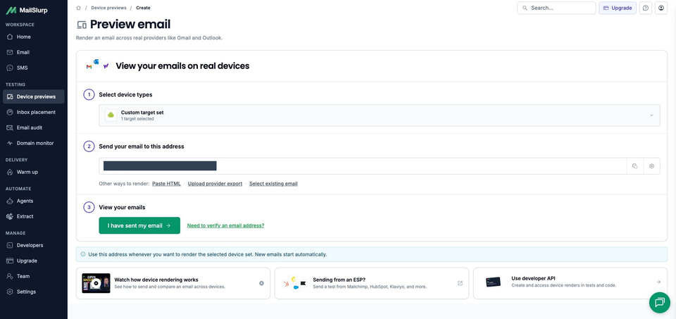
Choose Send email. Under Send your email to this address, copy the current render address and check it against the recipient field in your sending tool.
Copy it after selecting the intended target. An address from a different workspace or client set is not interchangeable with the one shown for this check.
3. Send the campaign and wait for the result
Send your finished campaign or test email to that address. If you use an email platform, its test-send option lets you inspect the message it produces, including any changes to personalization or links.
The subject in this example is Before the next downpour: gutter care from $160 + GST. You can download the sample campaign archive to inspect the design, hosted image and example links. Keep the same source when comparing modes.
Return to MailSlurp and choose I have sent my email. It opens the waiting view; receipt starts the render automatically. Our subject appeared with RUN CREATED, and View results opened the run.
Wait for COMPLETE and the Gmail Android Dark result to be READY. This run finished with one ready screenshot. If a result is still pending, check the existing message and run before sending another copy.
4. Open the dark image and read the smaller text
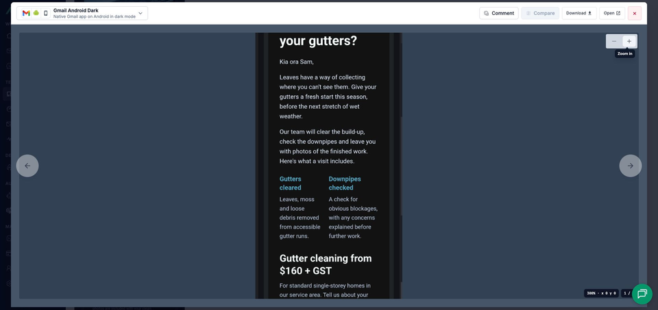
Open the completed result. The viewer identifies Gmail Android Dark and Native Gmail app on Android in dark mode. Use its zoom controls to read a detail, or Open to view the full image separately.
Start with the offer and service descriptions, then read the booking label against its yellow background. Continue through the pricing conditions and footer. A brighter heading can be easy to notice while the smaller text still needs closer attention.
Compare the same campaign in light and dark
Both results below use the same ClearRoof campaign and hosted photograph, captured on October 9, 2026. Look at the email surface first, then follow the same text down each image. Open the full-size images when you need to inspect the button or footer closely.
Gmail Android light

Gmail Android dark

What changed in the dark preview?
The white email surface becomes near black, while the main heading and body text become light. The ClearRoof brand and service labels appear brighter blue/teal against that darker surface. The gutter photograph is visible in both results.
The layout stays similar: Time to clear your gutters? takes two lines, and Gutters cleared and Downpipes checked remain side by side. The starting price, pricing conditions, signoff and full footer are still present. Changing the appearance did not make those columns stack in this capture.
The booking action is the detail to examine most closely. Book gutter cleaning keeps its yellow fill, but the label appears white in the dark result instead of dark in the light result. It looks less distinct against the yellow. This is why checking only the button's background is not enough to approve its readability.
The preferences and unsubscribe links, sample notice and photo credit also remain visible. Read them at full size alongside the offer, particularly when their text colors change.
How to review the button label before changing the design
Treat the label and its background as a pair. In this example, the yellow surface remains prominent while the lettering changes. Give a designer that specific observation so the next revision can address the part that needs attention.
Google's Gmail CSS reference helps when assessing a styling change. These screenshots show the outcome for this campaign; they do not identify which client transformation caused the color change. After editing the button, render the changed email in both modes before calling it a fix.
If your campaign uses a transparent wordmark, check it against the surrounding email surface as well. The dark-mode email preview guide walks through that image check.
MailSlurp features for repeated appearance checks
Send the final message from your email platform to a render address when you want to inspect what that platform produces. Template HTML and exported-message imports are also available for earlier design work or reproducing an existing email. The source guide explains those choices.
A saved target profile can keep your routine light and dark selections together. MailSlurp's comments and share links help another reviewer find the affected client and element. A note such as "Check the white booking label against the yellow button" tells a colleague exactly where to look.
Application teams can use the rendering API in CI to retain screenshots with the email produced by a test. That gives the next review a known campaign revision and client set to work from.
Which other apps should you check in dark mode?
Keep the light target in the review, then add the other apps your customers use. Gmail iOS, iOS Mail and Outlook Android are separate phone checks; Gmail.com and the desktop clients answer different questions again. Select an explicitly named dark variant where the picker offers one.
| Device | Email app | Appearance |
|---|---|---|
| Android phones | Gmail, Outlook | Light and dark |
| iPhone | Gmail, Apple Mail, Outlook | Default |
| iPad | Apple Mail | Default |
| Mac | Apple Mail | Default |
| Windows | New Outlook, Outlook Classic | Default |
| Webmail | Gmail | Light and dark |
| Webmail | Outlook.com, Yahoo Mail | Default |
Choose the available clients and modes in your workspace when starting a preview. Test the apps your customers use, including dark mode where it is offered.
Use the same campaign source for those checks, and inspect the text, images and actions in each app before approving its colors.
Read the price conditions before approving the offer
A customer deciding whether to book needs the service description, starting price and conditions as well as an obvious action. If the button lettering takes extra effort to read, or quieter terms become difficult to find, the design has put another obstacle between the offer and the booking.
Read the dark version from the headline through the last link before signing it off. Then test your real campaign's booking destination from a controlled message. The sample uses example URLs, and the screenshot confirms appearance rather than a completed booking.