
Preview Email in Apple Mail on Mac
Send a campaign to MailSlurp and review it in Apple Mail on Mac. Inspect the photograph, service columns, line lengths and booking action in the desktop view.

A campaign can fit a phone neatly and still feel awkward on a desktop: a photograph may dominate the message, or a short offer may sit in a sea of empty space. Open the email in Apple Mail on Mac before signing off the desktop version.
MailSlurp's Apple Mail target lets you send the campaign and inspect it in the macOS Mail app. Our fictional ClearRoof gutter-care offer appears as a centered white message, with two service descriptions beside each other and a single-line price. We'll review how those pieces lead from the photograph to the booking action.
What should you review in the Mac reading view?
Look at the message as a composition. Can you move naturally from the headline to the explanation and price? Do the service descriptions feel connected, and is the booking action easy to find after reading them?
Those questions differ from checking whether a phone stacks two blocks. The iPhone Mail walkthrough and iPad Mail walkthrough are useful companion checks. The Apple Mail family guide explains the wider device selection.
Opening a test on one Mac is easy when it is yours. Repeating that review alongside phone, tablet and Outlook tests after each edit takes more coordination. MailSlurp collects the selected client results from the same message, so a reviewer can inspect the current campaign without asking everyone for a fresh screenshot.
Step-by-step guide: preview email in Apple Mail on Mac
You'll need a MailSlurp workspace with device previews available and enough preview credits for the selected target. We tested Apple Mail, the macOS Mail app target, on October 9, 2026 (NZDT).
The fictional ClearRoof campaign includes a hosted gutter photograph, two descriptions of the work, a starting price of $160 + GST and a booking action. Its pricing conditions and complete footer are included in the review.
1. Select the Apple Mail desktop target
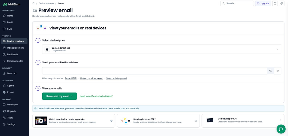
Open the new device preview form, or choose Start new render from Device previews.
Expand Custom target set and select Apple Mail. Keep only that target selected for this check and confirm 1 target selected. Check that a saved profile has not added other clients.
Choose Apple Mail for the Mac app. iOS Mail and iPadOS Mail are the separate phone and tablet selections.
2. Copy the current render address
Choose Send email, then copy the address under Send your email to this address. Compare it with the recipient in your sending tool before sending.
Take the address after selecting the Mac target, from your current workspace. This keeps the campaign tied to the preview you just configured.
3. Send the campaign and wait for Apple Mail
Send the campaign or test email to that address. For a campaign in an email platform, use the test-send option to review the message it produces, including its current content, personalization and footer.
The sample subject is Before the next downpour: gutter care from $160 + GST. You can download the sample email to inspect its source and photograph URL. Use the unchanged message when comparing it with phone or tablet previews.
Return to MailSlurp and choose I have sent my email. The control opens the waiting view; receipt triggers the render automatically. Our matching campaign appeared with RUN CREATED, then View results opened the run.
Wait for COMPLETE and a READY Apple Mail result. This run finished with one ready screenshot. Check the existing message and run before sending another copy if the result is still pending.
4. Open the result and inspect the desktop layout
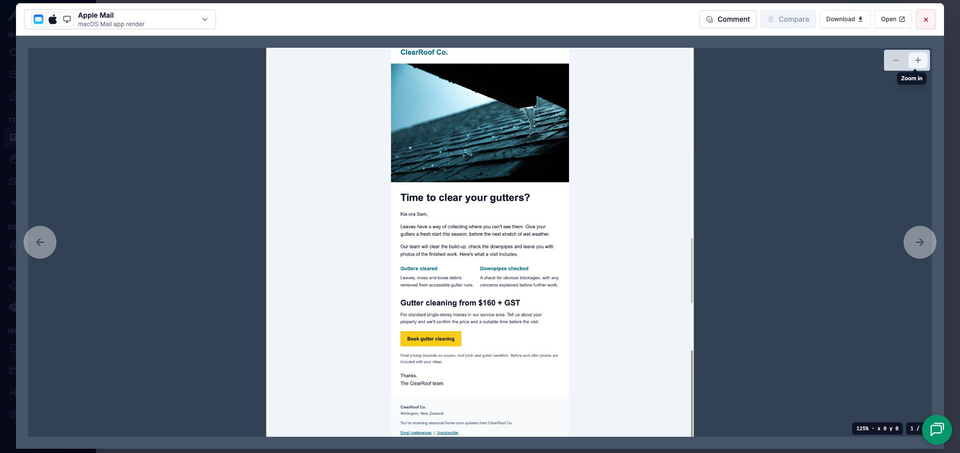
Open the completed screenshot. The viewer identifies Apple Mail and macOS Mail app render. Use its zoom controls for detail, or Open to view the complete image separately.
Start with the whole composition, then read each service description and the price. Check the smaller conditions and footer at full size before approving the message.
How does the campaign occupy the reading area?
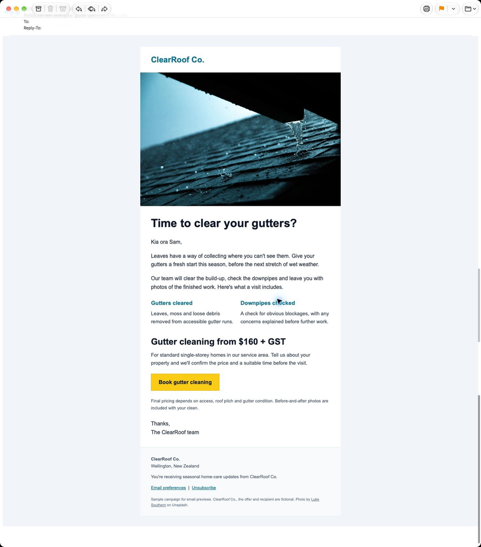
The white campaign sits in the middle of a wide, pale surround. The gutter photograph spans the campaign panel beneath ClearRoof Co., keeping the offer together with room around it inside the Mail window.
Time to clear your gutters? fits on one line. The greeting and introduction lead into a shared row for Gutters cleared and Downpipes checked. Each service heading has its description beneath it, with both descriptions taking two lines in this result.
The next heading, Gutter cleaning from $160 + GST, also stays on one line. The service-area paragraph leads to Book gutter cleaning, which retains its yellow fill and dark label. Final-pricing conditions and the signoff follow the action.
The full footer is visible, including company details, email preferences, unsubscribe, the sample notice and photo credit.
What should you check when two services share a row?
Read the descriptions across the row, then move down to the price. In this campaign they are short enough to make a balanced pair. If you add a longer explanation to one service, look again at the space between that row and the price rather than assuming the existing screenshot still represents the design.
Keep the introductory paragraph in that review too. It tells the reader that the visit includes gutter clearing, a downpipe check and photographs of the finished work. The two service blocks expand that explanation; their placement should help someone understand the offer without rereading it.
How does the Mac result compare with iPhone and iPad?
The matching iPhone Mail result uses the same campaign and photograph. Its services stack vertically, and the price takes two lines with + GST on the second. The Mac places the services side by side and keeps the complete price on one line.
The iPad Mail result also keeps the services in a row, with a single-line headline and price. Its tablet view remains a separate result. Use each screenshot to review the reading space it actually shows, rather than treating the Apple Mail name as one layout.
If you change a service description or heading, check those views again. The Mac review helps judge the side-by-side balance, while the phone shows how the same explanation reads as consecutive blocks.
MailSlurp features for a repeated desktop review
Keep the Mac and other clients you regularly review in a saved target profile. Send the finished campaign to its render address to inspect the message produced by your platform. HTML, exported emails and stored messages are also useful while editing a template or checking an application email.
When a designer needs to inspect a paragraph or image, comments and share links help bring them to the relevant result. The complete image keeps that detail in context. For application-generated messages, the CI workflow can preserve the rendered email alongside the test that produced it.
Which other desktop and web clients should you include?
Add New Outlook, Outlook Classic, Gmail.com, Outlook.com or Yahoo.com according to the clients your audience uses. Keep the relevant phone selections when the campaign also serves mobile readers.
| Device | Email app | Appearance |
|---|---|---|
| Android phones | Gmail, Outlook | Light and dark |
| iPhone | Gmail, Apple Mail, Outlook | Default |
| iPad | Apple Mail | Default |
| Mac | Apple Mail | Default |
| Windows | New Outlook, Outlook Classic | Default |
| Webmail | Gmail | Light and dark |
| Webmail | Outlook.com, Yahoo Mail | Default |
Choose the available clients and modes in your workspace when starting a preview. Test the apps your customers use, including dark mode where it is offered.
Select each required client explicitly and review its own result. Use the current picker to confirm the selections available in your workspace.
Does the photograph lead naturally into the offer?
The gutter photograph introduces the job, but the text explains what the customer can book. Look at the complete message once more: the headline should carry you into the service details, and the price and action should follow without a search.
For ClearRoof, that means understanding the visit before deciding to enquire. If the photo, a long paragraph or an awkward gap gets in the way, identify that part and review a new render after the edit. Then check the real booking page from a controlled email so the next step continues the offer clearly.