
guides
SVG or PNG for Email Logos? A Real Gmail and Outlook Comparison
Compare linked SVG, inline SVG and PNG in five real email clients. Choose a reliable campaign logo and test its size, visibility and dark-mode treatment.
Your designer sends a crisp SVG logo. It looks perfect on the website, but that leaves an unanswered question: will the campaign show the same mark in your customers' email apps?
For a straightforward campaign image, a tested PNG is a useful default. If you want to use SVG, first establish how it enters the email. A linked SVG file and SVG code pasted into the message are different cases. Our five-client test showed why that distinction matters.
The three versions we compared
We placed the same MailSlurp icon in one test email three ways:
- Linked SVG: an image element pointing to a hosted
.svgfile. - Linked PNG: an image element pointing to the matching hosted
.pngfile. - Inline SVG: the SVG drawing instructions included directly in the email's HTML.
SVG describes shapes; PNG stores pixels. Both source assets used the same 447 by 332 proportions, and the email requested a displayed size of 160 by 119 pixels. Labels made each version identifiable even when its image disappeared.
This was a controlled saved-email (EML) import into MailSlurp on September 29, 2026. It did not pass through an ESP editor, so it isolates the imported message rather than testing what Mailchimp or Klaviyo might change during upload and sending. Download the comparison email to repeat the test with your own targets.
What appeared in the five captures
| MailSlurp client target | Linked SVG | Linked PNG | Inline SVG |
|---|---|---|---|
| Gmail web | Visible | Visible | Not visible |
| Gmail Android | Visible | Visible | Not visible |
| Outlook Classic for Windows | Visible | Visible | Not visible |
| New Outlook for Windows | Visible | Visible | Not visible |
| Apple Mail on macOS | Visible | Visible | Visible |
"Visible" means the icon appeared in the captured result. It does not identify whether an intermediate service or client converted the SVG to pixels. These are results for this message and the named targets on the test date, rather than promises about every version or account configuration.
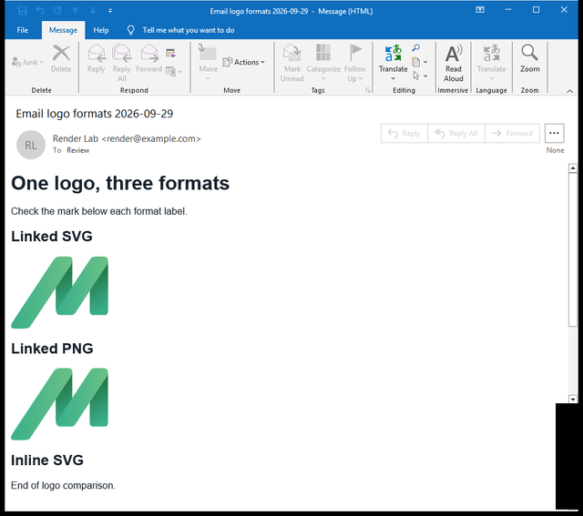
Outlook Classic: two visible marks
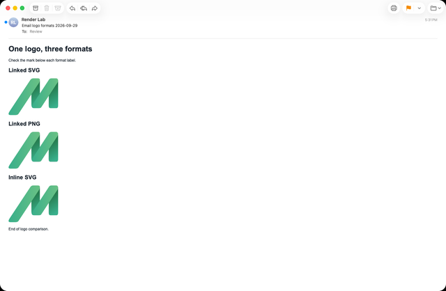
Apple Mail: three visible marks
The Can I Email SVG image reference tracks linked SVG separately and includes client-specific notes. Its September 16, 2026 test date is useful context, but your campaign still needs its own check. Do not apply a linked-image result to inline SVG simply because both have SVG in the name.
Choose the asset for the campaign you are sending
For a normal header logo, start with the export your email platform handles reliably and that passes your audience's client list. In our test, the linked PNG supplied the visible icon everywhere we checked. The linked SVG did too; the failed case was the inline drawing.
If your imported template contains inline SVG, ask the designer to replace that element with a hosted image and rerender. Changing the filename in a folder does not change the HTML that the campaign actually sends. Check the received message after the replacement.
A PNG export also needs care. Use a source large enough for its intended display size, retain the correct aspect ratio, and inspect the result at normal reading size. A giant image is not automatically a better logo: it can add unnecessary download weight while appearing at exactly the same dimensions.
For a small icon, simplify details that become indistinct at the final size. For a wordmark, check the letters as well as the symbol. The right export is the one your reader can recognize in the actual email.
Format will not fix a contrast problem
A dark logo on a transparent background can become hard to read when the email surface turns dark. Converting that artwork from SVG to PNG preserves the same dark shapes and transparency; it does not necessarily improve contrast.
Check the logo on light and dark surfaces as a separate decision. Your approved alternative might use a different wordmark, a restrained solid backing or an icon with sufficient contrast. The dark-mode logo guide shows a real Gmail Android example and explains the tradeoff in using an opaque replacement.
Keep any treatment within the brand system. An improvised white box might restore visibility but still look wrong in the campaign. Compare it with the surrounding header, rather than approving the asset alone on a design canvas.
Test after the email platform handles the file
An uploaded asset and a delivered asset need not follow the same path. An ESP may reject a format, substitute another file or rewrite its URL. Check what the received email references before concluding that a client failed to display your original export.
For a Klaviyo flow, use the actual flow message and representative content. Send its test to a MailSlurp render address using the Klaviyo device-rendering walkthrough. For a Mailchimp campaign, follow the Mailchimp walkthrough.
Review the logo in the completed Gmail and Outlook results, then add Apple Mail or mobile variants relevant to the audience. If the mark is absent, compare the image URL and source format. If it is present but ugly, inspect size, aspect ratio, transparency and contrast before switching formats again.
Keep an approved email export with the template
Give the next person preparing a campaign a clearly named email asset, its intended display dimensions and the template that uses it. Keep the original vector master available for the designer, but make the approved campaign export easy to identify.
Repeat the preview when the logo, template or delivery platform changes. A past pass for an icon does not approve a new wordmark, and a pass for a linked image does not approve inline SVG. MailSlurp device previews let you check that final combination before it reaches your audience.