










Email client support report: CSS, images and dark mode (November 2026)
Which CSS, image formats and dark-mode rules work in Outlook, Gmail, Apple Mail and Yahoo? Results from test emails rendered on 12 real email apps.
Use with your tools
If you build HTML email, you have probably checked a support table before using a CSS feature or an image format. Can I use flexbox? Does Outlook round corners yet? Will this WebP logo show up? It is a sensible habit. The trouble is that most results in the widely used public tables were last tested between 2019 and 2021, and fewer than 1 in 20 has been re-tested since 2025.
A lot has changed since then. Microsoft has moved Windows users to a new Outlook that renders email in a completely different way. Apple and Google have shipped several mail app updates. Advice that was right in 2020 can be confidently wrong today.
So we tested again. For this report, we wrote three small test emails, one for CSS, one for images and HTML elements, and one for dark mode, and sent each one to 12 email apps in November 2026. Every result below comes from a screenshot of the delivered message, not from documentation. You can download the test emails and the full results and run them yourself.
How the tests work
The test emails
Each test email is a simple table. The left column names a feature. The right column contains a red block that turns green only if the email app applies the feature, or a visible element such as a rounded shape or an image that only appears when the feature works.
One rule per block
Rules that need a stylesheet, such as media queries and selectors, each sit in their own <style> block. Some email apps discard a whole block when they find one rule they don't support, so combining rules would hide results that do work. Effects such as rounded corners, shadows and gradients are written directly on their element as inline styles.
Where the screenshots come from
Checking 12 apps by hand means a Windows PC, a Mac, an iPhone, an iPad, an Android phone and several browsers, and a lot of screenshots. We sent the same HTML to each app with MailSlurp device previews, which capture the full message as delivered. The iPhone and iPad screenshots come from physical devices, the Android apps run on an Android emulator, and the desktop and webmail apps run in their own windows. We then read each feature row from the screenshots.
How automated device rendering works
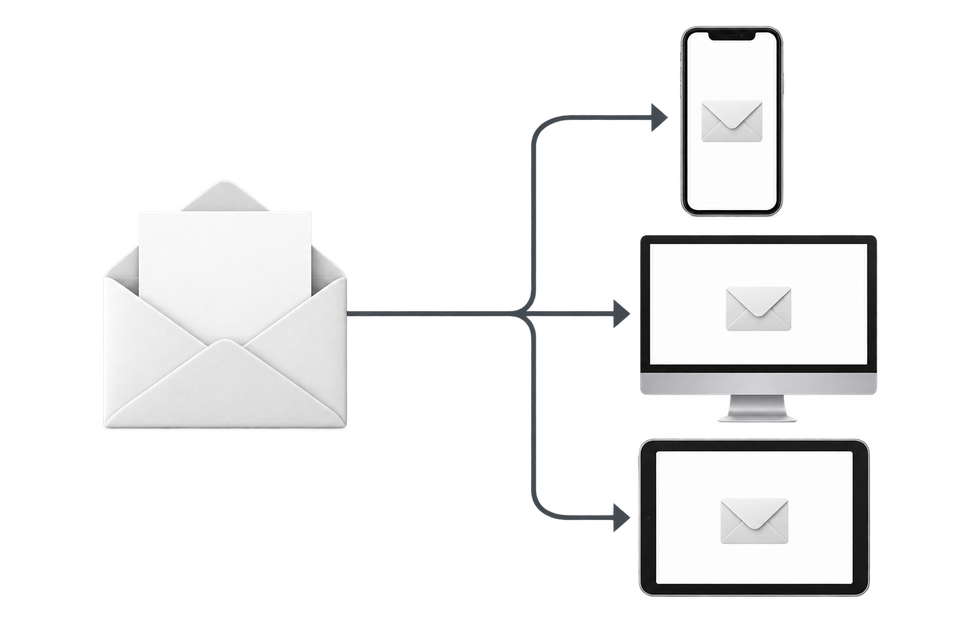
Choose the devices and email services you want to test, and MailSlurp gives you a special email address. Send your campaign to that address. MailSlurp opens the email in the selected apps and webmail services, then captures screenshots automatically.
The screenshots come back together, ready to compare across phones, tablets and computers. Check the layout, images and buttons, then share a result link so your team can review the same version of the email.
Key findings
The headlines, before the detail:
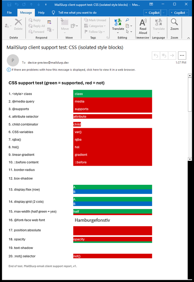
- Classic Outlook for Windows still supports almost no modern CSS. Of 20 CSS features, only
<style>class selectors worked. Evenrgba()colours,border-radiusandmax-widthwere ignored. - New Outlook for Windows is close to Apple Mail. It supported 17 of the 20 CSS features, including flexbox, grid, gradients and
position. It still ignored attribute selectors, CSS variables and web fonts. - "Outlook" is now four rendering engines. Outlook on the web, Outlook for Android and Outlook for iOS each supported 9 or 10 of the 20 features, and they differ from both Windows apps. A fix tested in one Outlook doesn't prove the others.
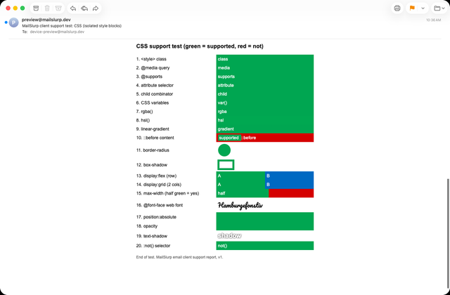
- Apple Mail on Mac, iPhone and iPad supported all 20 CSS features, plus inline SVG, a video player and
<details>. - Gmail on the web supports flexbox but not grid, and ignores CSS variables, web fonts,
box-shadowandtext-shadow. - The Gmail app ignores all embedded CSS for non-Google accounts. With an IMAP mailbox, such as Outlook.com, Yahoo or work mail read in the Gmail app, every
<style>rule was dropped on Android and iOS. Only inline styles applied. - Gmail on the web showed a transparent WebP image on a solid black background. The same image as PNG kept its transparency.
- Dark mode changes colours in different ways. Outlook for Android darkened our brand green from
#00a651to#005a09and applied the email's own dark-mode CSS. Gmail for Android left brand colours unchanged and ignored the dark-mode CSS.
CSS support
The two extremes: classic Outlook and Apple Mail
Here is the same CSS test in classic Outlook for Windows and Apple Mail on macOS. Classic Outlook leaves almost every row red. Apple Mail turns every row green.
Outlook for Windows (classic)
Apple Mail (macOS)
In between: new Outlook and Gmail on the web
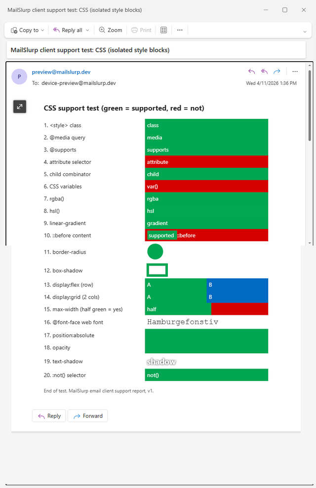
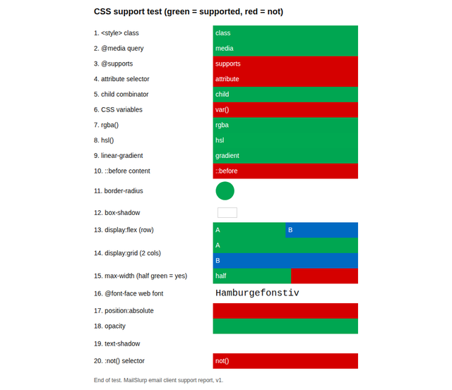
New Outlook for Windows and Gmail on the web sit between those two. New Outlook handled most of the layout features, while Gmail on the web dropped grid, shadows and web fonts.
New Outlook for Windows
Gmail (web)
Scores for all 12 apps
In summary, out of 20 CSS features:
| Email app | CSS features supported |
|---|---|
| Apple Mail (macOS, iPhone and iPad) | 20 |
| New Outlook for Windows | 17 |
| Outlook for Android, Outlook for iOS, Gmail (web), Yahoo Mail (web) | 10 |
| Outlook on the web | 9 |
| Gmail for iOS (IMAP account) | 7 |
| Gmail for Android (IMAP account) | 6 |
| Outlook for Windows (classic) | 1 |
Features to check before you rely on them
A few results are worth checking before you rely on a feature:
- Flexbox and grid: flexbox worked everywhere except classic Outlook and the Gmail apps with non-Google accounts. Grid also failed in Gmail on the web, Outlook on the web and Yahoo, but worked in Outlook for Android and iOS.
- Gradients and
hsl(): they worked in Gmail on the web but not in any Outlook outside Windows, or in Yahoo. - Web fonts: our
@font-facefont loaded only in Apple Mail. Every other app fell back to the next font in the stack, so choose that fallback deliberately. ::beforecontent: it worked in Apple Mail and new Outlook only.
Full CSS results for all 12 apps
| Feature | Apple Mail macOS | Apple Mail iPhone | Apple Mail iPad | New Outlook Windows | Classic Outlook Windows | Outlook web | Outlook Android | Outlook iOS | Gmail web | Gmail Android (IMAP account) | Gmail iOS (IMAP account) | Yahoo web |
|---|---|---|---|---|---|---|---|---|---|---|---|---|
<style> class selector |
Yes | Yes | Yes | Yes | Yes | Yes | Yes | Yes | Yes | No | No | Yes |
@media query |
Yes | Yes | Yes | Yes | No | Yes | Yes | Yes | Yes | No | No | Yes |
@supports |
Yes | Yes | Yes | Yes | No | No | No | No | No | No | No | Yes |
| Attribute selector | Yes | Yes | Yes | No | No | No | No | No | No | No | No | No |
Child combinator (>) |
Yes | Yes | Yes | Yes | No | Yes | Yes | Yes | Yes | No | No | Yes |
| CSS variables | Yes | Yes | Yes | No | No | No | No | No | No | No | No | No |
rgba() |
Yes | Yes | Yes | Yes | No | Yes | Yes | Yes | Yes | Yes | Yes | Yes |
hsl() |
Yes | Yes | Yes | Yes | No | No | No | No | Yes | Yes | Yes | No |
linear-gradient |
Yes | Yes | Yes | Yes | No | No | No | No | Yes | No | Yes | No |
::before content |
Yes | Yes | Yes | Yes | No | No | No | No | No | No | No | No |
border-radius |
Yes | Yes | Yes | Yes | No | Yes | Yes | Yes | Yes | Yes | Yes | Yes |
box-shadow |
Yes | Yes | Yes | Yes | No | Yes | Yes | Yes | No | Yes | Yes | No |
display: flex |
Yes | Yes | Yes | Yes | No | Yes | Yes | Yes | Yes | No | No | Yes |
display: grid |
Yes | Yes | Yes | Yes | No | No | Yes | Yes | No | No | No | No |
max-width |
Yes | Yes | Yes | Yes | No | Yes | Yes | Yes | Yes | Yes | Yes | Yes |
@font-face web font |
Yes | Yes | Yes | No | No | No | No | No | No | No | No | No |
position: absolute |
Yes | Yes | Yes | Yes | No | No | No | No | No | No | No | No |
opacity |
Yes | Yes | Yes | Yes | No | Yes | Yes | Yes | Yes | No | No | Yes |
text-shadow |
Yes | Yes | Yes | Yes | No | No | No | No | No | Yes | Yes | Yes |
:not() selector |
Yes | Yes | Yes | Yes | No | No | No | No | No | No | No | No |
Images, video and HTML elements
Image formats
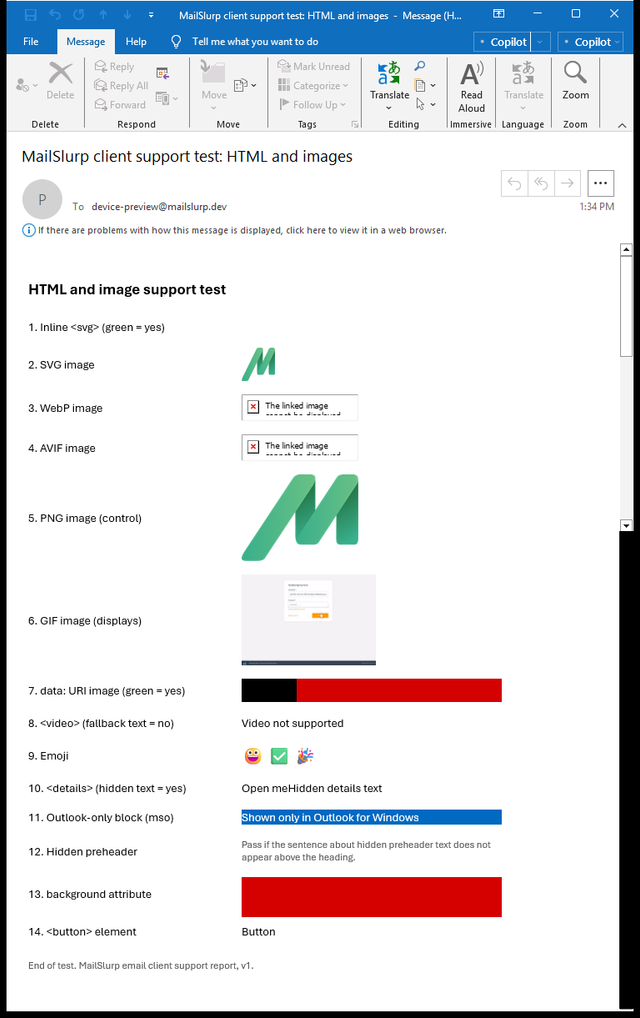
Every app displayed PNG, GIF and SVG images. WebP and AVIF displayed everywhere except classic Outlook, which showed "The linked image cannot be displayed" for both.
Inline SVG
Inline <svg> code is a different story from an SVG file in an <img> tag. Inline SVG worked only in Apple Mail and new Outlook, so use an image file if the graphic must appear for everyone.
Transparent WebP in Gmail
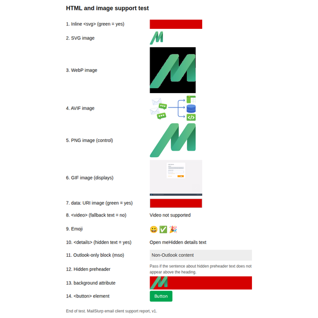
Gmail on the web displayed our transparent WebP logo on a solid black background, while the PNG version of the same logo kept its transparency.
Gmail (web)
Outlook for Windows (classic)
Video, collapsible sections and buttons
A video player appeared only in Apple Mail and new Outlook. Elsewhere, the fallback text inside the <video> tag was shown, apart from Outlook on the web, which showed nothing at all. <details> and <summary> collapsed the hidden text only in Apple Mail and Gmail for Android. Classic Outlook was the only app that rendered a <button> element as plain text. It ignored a table cell's background image, and so did both Gmail apps.
A screenshot shows whether a GIF displays, not whether it animates, so this report doesn't cover GIF animation.
Full image and HTML results for all 12 apps
| Feature | Apple Mail macOS | Apple Mail iPhone | Apple Mail iPad | New Outlook Windows | Classic Outlook Windows | Outlook web | Outlook Android | Outlook iOS | Gmail web | Gmail Android (IMAP account) | Gmail iOS (IMAP account) | Yahoo web |
|---|---|---|---|---|---|---|---|---|---|---|---|---|
Inline <svg> |
Yes | Yes | Yes | Yes | No | No | No | No | No | No | No | No |
| SVG image | Yes | Yes | Yes | Yes | Yes | Yes | Yes | Yes | Yes | Yes | Yes | Yes |
| WebP image | Yes | Yes | Yes | Yes | No | Yes | Yes | Yes | Yes | Yes | Yes | Yes |
| AVIF image | Yes | Yes | Yes | Yes | No | Yes | Yes | Yes | Yes | Yes | Yes | Yes |
| PNG image | Yes | Yes | Yes | Yes | Yes | Yes | Yes | Yes | Yes | Yes | Yes | Yes |
| GIF image (displays) | Yes | Yes | Yes | Yes | Yes | Yes | Yes | Yes | Yes | Yes | Yes | Yes |
<video> player shown |
Yes | Yes | Yes | Yes | No | No | No | No | No | No | No | No |
| Emoji | Yes | Yes | Yes | Yes | Yes | Yes | Yes | Yes | Yes | Yes | Yes | Yes |
<details> and <summary> |
Yes | Yes | Yes | No | No | No | No | No | No | Yes | No | No |
Outlook-only [if mso] block shown |
No | No | No | No | Yes | No | No | No | No | No | No | No |
| Hidden preheader stays hidden | Yes | Yes | Yes | Yes | Yes | Yes | Yes | Yes | Yes | Yes | Yes | Yes |
Table background image |
Yes | Yes | Yes | Yes | No | Yes | Yes | Yes | Yes | No | No | Yes |
<button> element |
Yes | Yes | Yes | Yes | No | Yes | Yes | Yes | Yes | Yes | Yes | Yes |
"Outlook-only block shown" is expected to be Yes only in classic Outlook for Windows, which reads [if mso] conditional comments.
Dark mode
Three different approaches
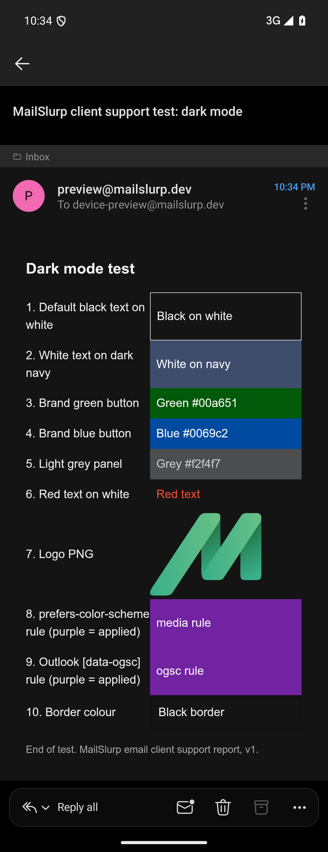
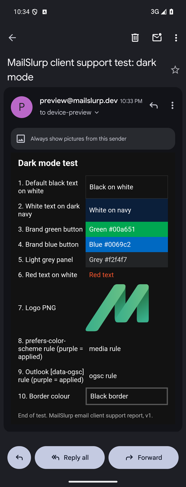
Dark mode doesn't follow one rule. Some apps leave your colours alone, some invert light colours only, and some recolour everything. We sent one dark-mode test email with a white page, a navy panel, brand green and blue buttons, a light grey panel, and two dark-mode CSS rules: a prefers-color-scheme media query and Outlook's [data-ogsc] selector.
Outlook for Android (dark)
Gmail for Android (dark)
| Colour or rule in the email | Outlook for Android | Gmail for Android (IMAP account) | Gmail (web) |
|---|---|---|---|
White page #ffffff |
#141414 |
#121212 |
Unchanged |
Navy panel #0b1f3a |
Lightened to #3e4d6c |
Unchanged | Unchanged |
Brand green #00a651 |
Darkened to #005a09 |
Unchanged | Unchanged |
Brand blue #0069c2 |
Darkened to #004a9f |
Unchanged | Unchanged |
Light grey panel #f2f4f7 |
#4b4d4f |
#222426 |
Unchanged |
prefers-color-scheme rule |
Applied | Not applied | Not applied |
Outlook [data-ogsc] rule |
Applied | Not applied | Not applied |
What it means for your email
Two practical consequences follow:
- Check button contrast in Outlook for Android. Darkening a brand colour can make it read differently from your style guide, even when it stays legible.
- Don't rely on dark-mode CSS for Gmail. Gmail's app chooses its own colours and ignores the media query, so test logos and text against its dark background instead.
So far we have measured dark mode in Outlook for Android, Gmail for Android and Gmail on the web. We can't yet capture Apple Mail, Outlook for Windows or Outlook for iOS in dark mode, so those apps aren't covered here.
Gmail apps with non-Google accounts
Many people read Outlook.com, Yahoo or work mail in the Gmail app. In that setup, the Gmail app on Android and iOS dropped every rule in our <style> blocks, including plain class selectors and media queries. Only inline styles such as border-radius, rgba(), max-width and text-shadow applied.
For those readers, keep critical styling inline and make sure the email still reads well as a single column. Gmail apps signed in to a Google account handle embedded styles differently, so test both if your list includes both kinds of reader.
Download the test emails and results
- CSS test email (HTML)
- Image and HTML test email (HTML)
- Dark mode test email (HTML)
- All results as JSON
Our Gmail app devices read mail through IMAP accounts, so the Gmail app results reflect that setup.
To check one feature in your own email rather than these tests, the email feature compatibility table lists published support data, and a free email render shows how your message looks on real devices.
Frequently asked questions
Which Outlook should I test first?
Test the ones your recipients use. If your list has many Windows business users, classic Outlook is still the strictest, and anything that works there will usually degrade gracefully elsewhere. New Outlook, Outlook on the web and the mobile apps each behave differently, so check them separately.
Can I use flexbox in email now?
Flexbox worked in 9 of the 12 apps we tested. Classic Outlook for Windows stacked the items, and so did the Gmail apps with non-Google accounts, which ignore embedded CSS. If your layout must stay side by side in classic Outlook, use table columns.
Why does my email look fine in Gmail on the web but not in Outlook?
Gmail on the web supports features that most Outlook apps don't, including hsl() colours and gradients. Classic Outlook ignores nearly all of them. Compare the email in both before you send.
How often is this report updated?
We plan to re-run the same tests every quarter and add apps as our device coverage grows. Each edition keeps its own test emails and results file, so changes between editions are easy to compare.