










How Gmail dark mode changes your email colours (tested on Android and the web)
Which colours Gmail changes in dark mode, and whether it applies prefers-color-scheme. Measured colour values from Gmail for Android and Gmail on the web.
Use with your tools
Dark mode has quietly become the default for a lot of people. They switch their phone over once and never switch it back. For email designers that creates an odd situation: some email apps respond by recolouring your email for the reader, and you never get a say in the new colours.
Most of the time the result is fine. White backgrounds go dark, black text goes light, and the email stays readable. But it is easy to get caught out. A logo with dark lettering can vanish into a dark background. A red warning can turn orange. A light grey panel can blend into the page. And because it only happens on the reader's phone, you rarely see it until someone sends you a screenshot.
Gmail is the obvious place to start, so we tested exactly what it changes. This guide shows the results colour by colour, explains what Gmail does with your own dark-mode CSS (spoiler: nothing), and covers what to check before you send.
How dark mode works in email
Two ways an app can handle dark mode
An email app can deal with dark mode in two broad ways. It can leave the email alone and only darken its own interface around it, or it can recolour the email itself, deciding which of your colours to swap for darker or lighter ones. Some apps also honour a dark version that you design yourself in CSS.
Your own dark-mode CSS
The standard way to design that dark version is a prefers-color-scheme: dark media query, a CSS rule that applies only when the reader's device is in dark mode. Some designers also add Outlook-specific selectors such as [data-ogsc]. Whether these rules do anything depends entirely on the app.
How we tested Gmail dark mode
The test email
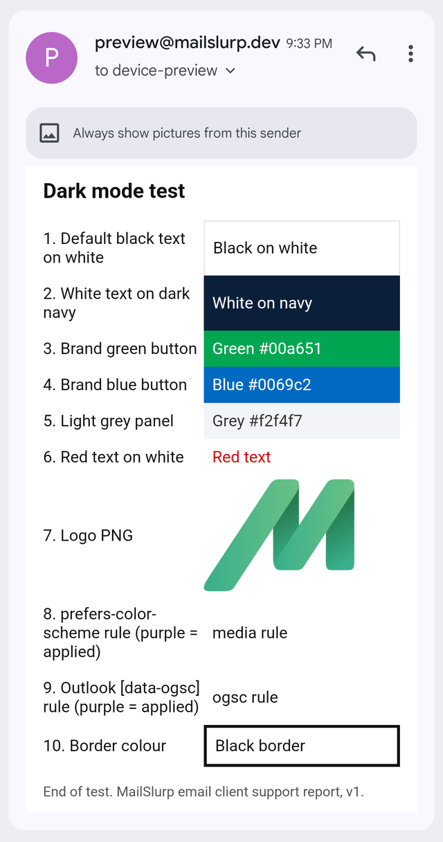
We built a dark mode test email with the kinds of colours real emails use: a white page, black text, a navy panel, green and blue buttons, a light grey panel, red text, a transparent logo and a black border. It also contains two dark-mode CSS rules, the standard prefers-color-scheme media query and the Outlook-specific selector. If either rule applies, its line turns purple.
What we compared
We opened the email in Gmail for Android and Gmail on the web, once in light mode and once in dark mode, and measured the colours from the pixels in the screenshots. Our Gmail for Android test device reads mail through an IMAP account. These results are from our November 2026 tests.
Checking this by hand means switching a phone into dark mode and sending yourself every revision. We used MailSlurp, an email testing platform that can capture Gmail for Android in both light and dark mode automatically.
How automated device rendering works
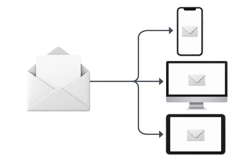
Choose the devices and email services you want to test, and MailSlurp gives you a special email address. Send your campaign to that address. MailSlurp opens the email in the selected apps and webmail services, then captures screenshots automatically.
The screenshots come back together, ready to compare across phones, tablets and computers. Check the layout, images and buttons, then share a result link so your team can review the same version of the email.
What Gmail for Android changes in dark mode
The same email, light and dark
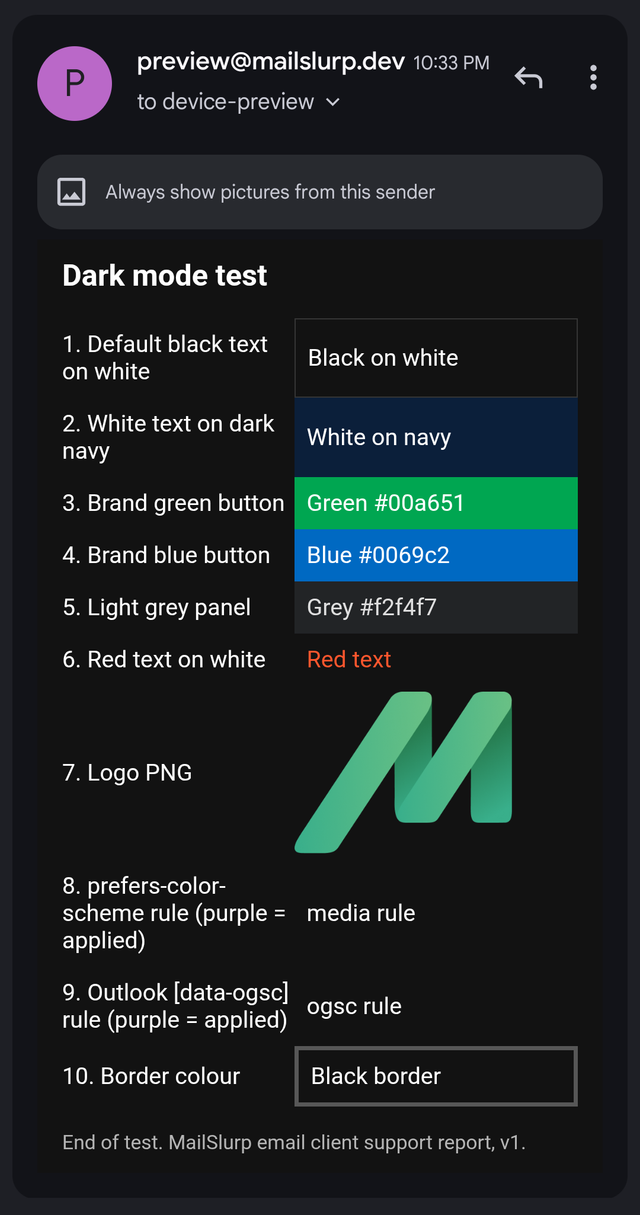
Here is the test email in Gmail for Android, first in light mode and then in dark mode. Notice which colours change and which stay put.
Gmail for Android (light)
Gmail for Android (dark)
Every colour change we measured
| In the email | Gmail for Android, dark mode | Gmail on the web, dark theme |
|---|---|---|
White background #ffffff |
#121212 |
Unchanged |
Black text #111111 |
#ffffff |
Unchanged |
Black border #111111 |
#575757 |
Unchanged |
Red text #d50000 |
#ff562d |
Unchanged |
Light grey panel #f2f4f7 |
#222426 |
Unchanged |
Navy panel #0b1f3a |
Unchanged | Unchanged |
Brand green #00a651 |
Unchanged | Unchanged |
Brand blue #0069c2 |
Unchanged | Unchanged |
prefers-color-scheme: dark rule |
Not applied | Not applied |
Outlook [data-ogsc] rule |
Not applied | Not applied |
The pattern behind the numbers
Gmail for Android changes the light parts of your email and the very dark text, and leaves everything in between alone. White became near-black, black text became white, and the pale grey panel turned dark grey. The saturated colours, our green and blue buttons and the navy panel, kept their exact values. Red text was the one coloured element that shifted, to a lighter orange-red that reads better on a dark background.
Your dark-mode CSS is ignored
Neither of our dark-mode rules turned purple. In the Gmail app, Gmail decides your dark colours, not your stylesheet. You can still include a prefers-color-scheme block for the apps that use it, but don't design around it for Gmail.
What Gmail on the web does
With Gmail's dark theme turned on, Gmail on the web darkened its own interface and left our message body exactly as sent, with its white background and original colours. So a reader using Gmail in a dark browser theme sees your light email surrounded by a dark frame.
What to check before you send
Logos
Check logos on a #121212 background. A transparent PNG logo with dark lettering will sit on a near-black background in the Gmail app. Our green logo stayed readable; a black wordmark would not. Give dark logos a light outline or a solid light background with a little padding.
Colours that carry meaning
Expect warning colours to shift. Our red #d50000 became the orange-red #ff562d. If colour carries meaning, such as an overdue balance or an error, add a word or an icon as well.
Buttons
Buttons in saturated colours are safe. Gmail kept our green and blue buttons as they were, so white button text stayed readable.
Light panels
Light grey panels lose contrast with the page. Our #f2f4f7 panel became #222426 on a #121212 page, which is hard to tell apart. Use a border if the panel's edge matters.
How other apps compare
Outlook for Android takes the opposite approach. It darkened our brand green from #00a651 to #005a09, lightened the navy panel, and applied both dark-mode CSS rules. The dark mode colour map shows what both Android apps did to 99 colours, the November 2026 report has the side-by-side comparison, and the dark mode email preview guide explains how to check your own email.
What these tests don't cover
- Gmail for iOS in dark mode.
- The Gmail app signed in to a Google account. Our Gmail for Android test device reads an IMAP account.
- Apple Mail and Outlook for Windows in dark mode. So far we have measured dark mode in Gmail and Outlook for Android and Gmail on the web.
The test email is free to download: dark mode test email (HTML). More results by app are on the email client support hub.
Frequently asked questions
Does Gmail support prefers-color-scheme?
Not in our tests. Gmail for Android and Gmail on the web both ignored our prefers-color-scheme: dark media query.
Why does my logo disappear in Gmail dark mode?
Gmail for Android turns the white background to #121212 but leaves image pixels alone, so dark parts of a transparent logo end up on a near-black background. Give the logo a light outline or a solid background.
Does Gmail on the web change email colours in dark mode?
Not in our test. With Gmail's dark theme on, the message body kept its original white background and colours.
How do I preview my email in Gmail dark mode?
You can switch your own phone to dark mode and send yourself a test, or use a device preview service that captures Gmail in dark mode for you. See how to preview email in Gmail for Android dark mode.