










HTML email code that works in Outlook, Gmail and Apple Mail: six patterns tested on 12 apps
Six HTML email patterns tested on 12 email apps: a bulletproof button, stacking columns, a VML background, a fluid image, a rounded card and lists.
Use with your tools
Search for "HTML email button" and you will find hundreds of snippets, nearly all of them promising to "work in Outlook". Some do. Some did, in 2016. Some work in one Outlook and quietly fall apart in another. The only way to know is to try them, and trying them properly means opening the email in the awkward apps, not just the friendly ones.
So these six patterns come with screenshots instead of promises. They cover the building blocks most emails need: a button, two columns, a background image, a full-width image, a card and a list. Each one is written to work without relying on features that some apps strip out, and each has a fallback for classic Outlook for Windows where it needs one.
How we tested the patterns
The test email
We put all six patterns into one test email and sent it to 12 email apps, including the two hardest: classic Outlook for Windows, which lays out email with Microsoft Word's engine, and the Gmail apps reading non-Google mailboxes, which throw away the email's <style> block. In our November 2026 tests, all six patterns worked in all 12 apps.
The screenshots
Each pattern below shows four of the apps side by side: classic Outlook, new Outlook, the Gmail app for Android and iPhone Mail. The full test email is free to download if you want to see the rest.
If you copy a pattern and change it, test the result: a different width or colour can change how classic Outlook draws it. The screenshots come from MailSlurp, an email testing platform that captured the test email in all 12 apps automatically.
How automated device rendering works
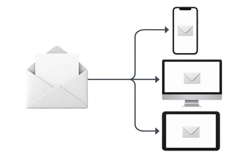
Choose the devices and email services you want to test, and MailSlurp gives you a special email address. Send your campaign to that address. MailSlurp opens the email in the selected apps and webmail services, then captures screenshots automatically.
The screenshots come back together, ready to compare across phones, tablets and computers. Check the layout, images and buttons, then share a result link so your team can review the same version of the email.
The six patterns
Each pattern has a short explanation, the code, and what it looked like across the apps. Copy the code as a starting point and swap in your own colours, text and links.
Bulletproof button
A button that is a padded link inside a coloured table cell works without CSS support, and a VML shape gives classic Outlook a button of the same size.
Code for the button
<table role="presentation" cellpadding="0" cellspacing="0" border="0"><tr>
  <td align="center" bgcolor="#00a651" style="border-radius:6px;background:#00a651">
    <!--[if mso]><v:roundrect xmlns:v="urn:schemas-microsoft-com:vml" href="https://example.com/"
      style="height:44px;v-text-anchor:middle;width:200px" arcsize="14%" stroke="f" fillcolor="#00a651">
      <center style="color:#ffffff;font-family:Arial,sans-serif;font-size:16px;font-weight:bold">Confirm booking</center>
    </v:roundrect><![endif]-->
    <!--[if !mso]><!-- --><a href="https://example.com/" style="display:inline-block;padding:12px 24px;font-family:Arial,Helvetica,sans-serif;font-size:16px;font-weight:bold;line-height:20px;color:#ffffff;text-decoration:none;border-radius:6px">Confirm booking</a><!--<![endif]-->
  </td>
</tr></table>
How the button looked
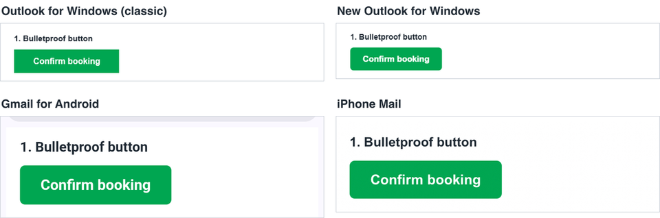
The button displayed in all 12 apps. Classic Outlook drew the VML version at its fixed width, but the corners came out square, because the cell's green background fills the space behind the rounded VML shape. If rounded corners matter in classic Outlook, remove bgcolor and background from the cell and let each version draw its own shape.
Two columns that stack without media queries
Media queries don't reach every phone: the Gmail apps reading IMAP accounts dropped them in our media query tests. This pattern uses inline blocks with a maximum width, so the columns wrap when the screen is too narrow, and an [if mso] table keeps them side by side in classic Outlook.
Code for the two columns
<td style="padding:6px 8px 16px;font-size:0;text-align:left">
  <!--[if mso]><table role="presentation" width="568" cellpadding="0" cellspacing="0" border="0"><tr><td width="284" valign="top"><![endif]-->
  <div style="display:inline-block;width:100%;max-width:284px;vertical-align:top">
    <!-- column A content; reset font-size inside -->
  </div>
  <!--[if mso]></td><td width="284" valign="top"><![endif]-->
  <div style="display:inline-block;width:100%;max-width:284px;vertical-align:top">
    <!-- column B content -->
  </div>
  <!--[if mso]></td></tr></table><![endif]-->
</td>
How the two columns looked
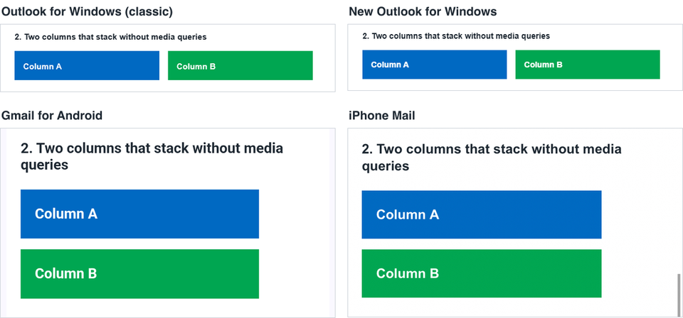
The columns sat side by side in every desktop and webmail app and stacked in all five phone apps, including both Gmail apps. Set the text size again inside each column, because the wrapper's font-size: 0, which removes the gap between the blocks, is inherited. Put column text in table cells with their own font size, as this pattern does. In our framework tests, one framework's column layout clipped multi-line text in classic Outlook.
Background image with a VML fallback
Classic Outlook only shows background images drawn with VML. Other apps use the background attribute and CSS. This pattern sets all three on the same cell.
Code for the background image
<td background="https://example.com/hero.png" bgcolor="#0b1f3a" valign="middle" height="140"
    style="background:#0b1f3a url('https://example.com/hero.png') no-repeat right center / 140px auto;height:140px">
  <!--[if gte mso 9]><v:rect xmlns:v="urn:schemas-microsoft-com:vml" fill="true" stroke="false" style="width:568px;height:140px">
    <v:fill type="frame" src="https://example.com/hero.png" color="#0b1f3a" />
    <v:textbox inset="0,0,0,0"><![endif]-->
  <div><!-- headline table --></div>
  <!--[if gte mso 9]></v:textbox></v:rect><![endif]-->
</td>
How the background image looked
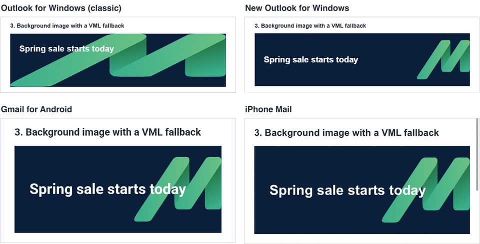
The background showed in all 12 apps, including the Gmail app for Android, which ignored every simpler background technique in our background image tests. Classic Outlook stretched the image to fill the whole area, because type="frame" scales the image to the shape. Use an image designed for the full banner size, or type="tile" for a pattern. Always set a solid bgcolor that keeps the text readable on its own.
Fluid image
A full-width image needs a fixed width attribute for classic Outlook and a CSS max-width for everything else.
Code for the fluid image
<img src="https://example.com/photo.png" width="568" alt="Describe the image"
     style="display:block;width:100%;max-width:568px;height:auto;border:0">
How the fluid image looked
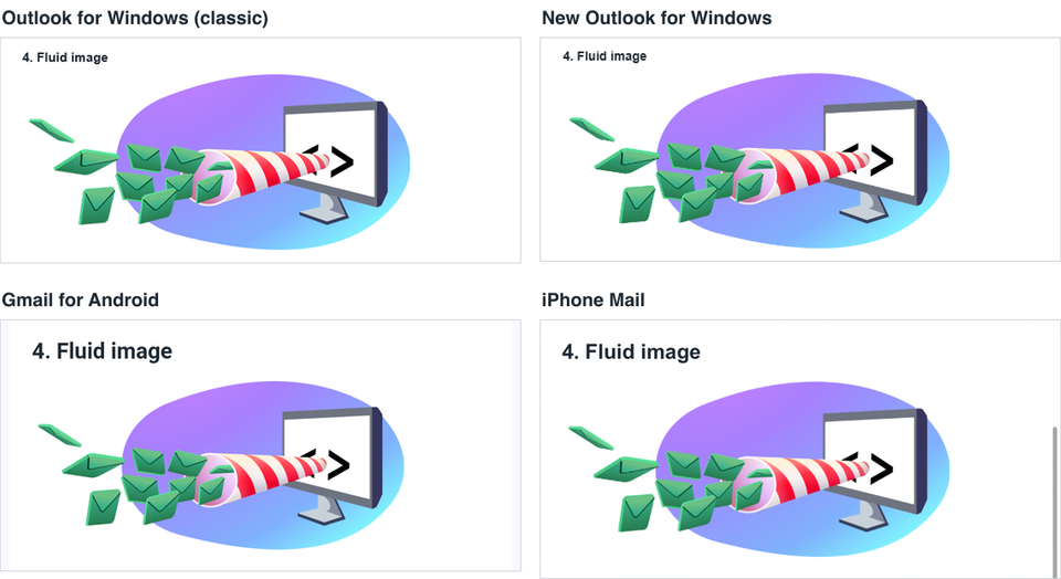
The image fitted the column in all 12 apps and never overflowed the screen. display: block removes the small gap some apps add under images.
Bordered card with rounded corners
A border on a table cell, with border-radius as a progressive extra.
Code for the card
<td style="border:2px solid #0069c2;border-radius:12px;padding:16px">Card content</td>
How the card looked
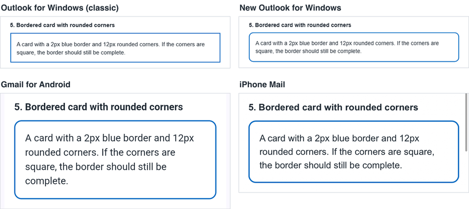
The border was complete in all 12 apps. Classic Outlook showed square corners, as it ignores border-radius; every other app rounded them. Design the card so square corners still look intended.
Bulleted lists
HTML lists are the natural choice, but each app sets its own list spacing. A small table gives you exact control.
Code for the lists
<table role="presentation" cellpadding="0" cellspacing="0" border="0">
<tr><td valign="top" width="18">•</td><td>Free returns within 30 days</td></tr>
<tr><td valign="top" width="18">•</td><td>Ships in 2 working days</td></tr>
</table>
How the lists looked
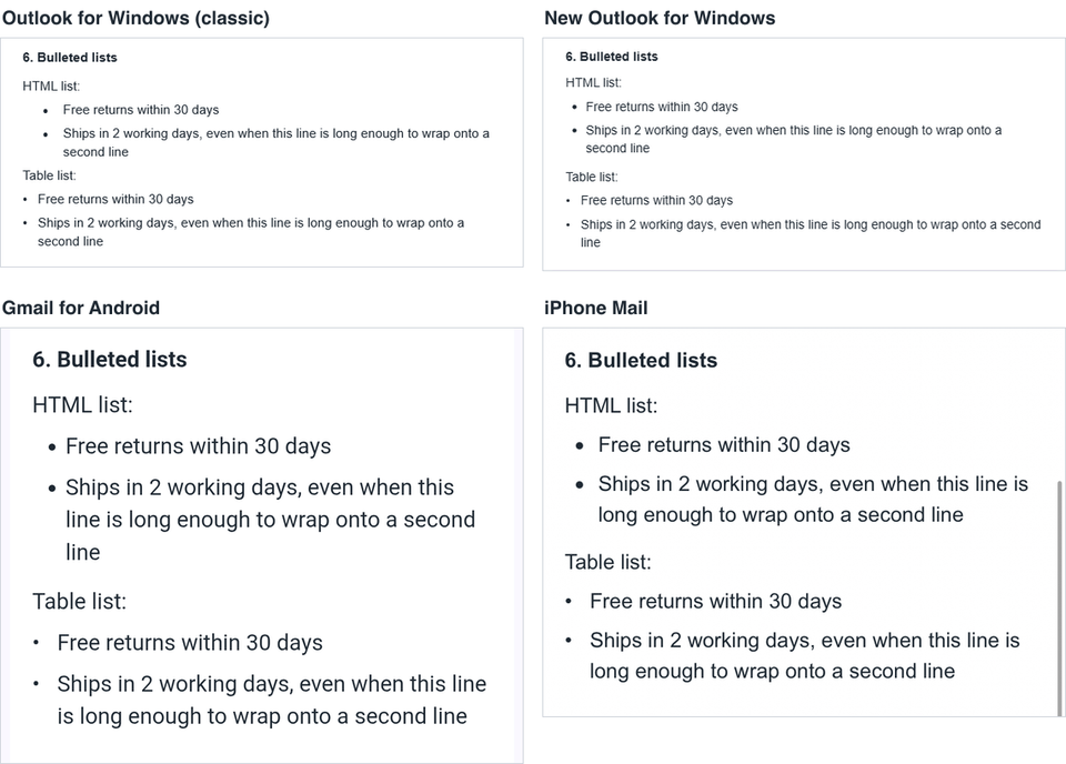
Both lists were readable everywhere, and wrapped lines stayed aligned. Classic Outlook indented the HTML list further than the other apps, ignoring our padding-left. The table list lined up identically in all 12 apps, so use it when alignment with the text around it matters.
Frequently asked questions
Do I still need VML for Outlook?
For classic Outlook for Windows, yes, if you want background images or rounded buttons. New Outlook, Outlook on the web and the Outlook mobile apps ignore VML and use your normal HTML, so both versions need to look finished.
Why not use a <button> element?
Classic Outlook for Windows showed <button> as plain text in our Outlook tests. A styled link in a table cell works everywhere.
Where can I find complete templates that use these patterns?
Our free transactional email templates use the button, the fluid layout and the table list, and were tested on the same 12 apps.