
guides
Your Email Background Disappeared: Keep the Message Readable
See how one email background changes in Outlook and Gmail, then choose a solid-color fallback or foreground image that preserves the campaign's offer.
The campaign's hero image disappears in Outlook, leaving pale text on an empty surface. Or it appears in Gmail, but at a size that competes with the headline. Both problems can come from the same background-image treatment.
Start by separating the message from its backdrop. Give important copy a readable solid-color fallback, and use a normal foreground image for essential artwork when that suits the design. Then compare the repaired email in the client that failed and the other apps your audience uses.
Is it a background or a normal image?
A foreground image occupies its own place in the email, like a product photo above a description. A background image sits behind other content, often with a headline or button layered over it.
That distinction changes the repair. If a normal image is missing, investigate its URL, format and download behavior using the missing-image guide. If the text remains but the backdrop is gone or misplaced, inspect the background treatment and the text's fallback contrast.
Ask the designer which mechanism the template uses. You do not need to identify it by looking at the editor: two designs can look identical there while using different HTML.
One background, four different client checks
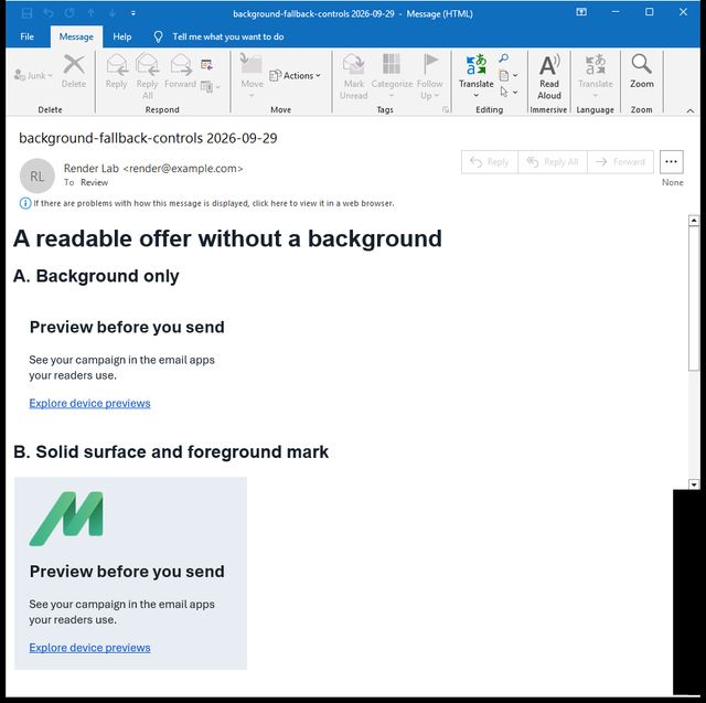
On September 29, 2026, we tested a small email with two versions of the same message. Version A placed a MailSlurp icon behind the copy using a CSS background. Version B used a solid pale-grey surface and a separate foreground icon, with the same headline, description and link.
The test used a controlled saved-email file, or EML, imported into MailSlurp. It was not an ESP campaign export.
| Client target | Background version | Solid surface and foreground image |
|---|---|---|
| Outlook Classic for Windows | Background icon absent | Icon and copy visible |
| New Outlook for Windows | Icon visible behind copy | Icon separated from copy |
| Gmail Android | Background icon enlarged behind copy | Icon separated from copy |
| Apple Mail macOS | Icon visible behind copy | Icon separated from copy |
Outlook Classic: background absent
Gmail Android: background enlarged
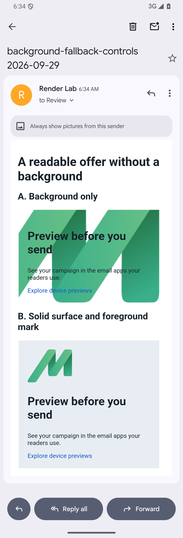
The words remained visible in all four captures because this fixture used dark text on a light surface. A campaign with white text relying on a photograph would need its own contrast check. We did not test dark mode in this background experiment.
You can download the background comparison EML. Its value is the visible difference between the two arrangements, rather than a claim that every CSS background fails in a particular app.
Choose the smallest repair that preserves the offer
If the background is decorative, the simplest useful fallback may be a solid color. Choose it together with the text color. The headline, conditions and button should remain readable when the photograph is absent.
If the image contains essential information, move that information into real text. A venue address or discount condition should not disappear with the backdrop. A logo or product photograph can often become a foreground image above the copy instead of sitting behind it.
If the layered composition is important, ask a template developer for a targeted client fallback. Some Classic Outlook designs use VML, an older Microsoft markup format, to provide a background or button treatment. Litmus' background-image reference covers implementation details. VML is a specific tool to evaluate, not a required ingredient in every email.
Our Outlook preview guide includes a separate tested repair for a more complex email. Use that when the task is choosing Outlook targets or comparing the complete campaign; use the decision here when choosing what the hero should do without its backdrop.
Check text length as well as the picture
A fallback that works with a two-word heading may fail with a translated offer or a longer product name. Add realistic copy before approving the new arrangement.
Read the headline, price, date and primary action in sequence. The picture should not cover the words, force an awkward reading order or make a link indistinct. If the content needs a taller section, allow that space rather than cropping the copy to preserve the original hero height.
Compare the final image crop too. A photograph that looks balanced on desktop may place its brightest or busiest area behind the text on a phone. Moving the picture into its own block can avoid that dependency altogether.
Send the revision from the campaign platform
Update a copy of the campaign and send it through the same path you plan to use for customers. For a Mailchimp newsletter, use the Mailchimp rendering guide. Salesforce Marketing Cloud teams can follow the Salesforce guide for their provider workflow.
Start the comparison with the affected client. Then inspect another desktop app, a phone-width result and the available light/dark combinations relevant to the audience. Identify the Outlook version before treating one Outlook screenshot as approval for another.
The repaired campaign should answer the same customer questions with or without the background: what is offered, what matters about it, and where to go next. Once those answers stay readable, the picture can do its proper job of supporting them.