










Free transactional email templates tested in Outlook, Gmail and Apple Mail
Five free HTML transactional email templates: password reset, verification code, receipt, welcome and invite. Each one tested on 12 real email apps.
Use with your tools
Password resets, sign-in codes and receipts are the emails people actually wait for. Nobody skims a password reset and moves on; they are sitting there, refreshing their inbox, waiting to get back into their account. If that email arrives with a broken button in Outlook or a layout that spills off a phone screen, the reader can't finish what they started, and a support ticket usually follows.
These emails also tend to get less design attention than marketing campaigns. They are often built once, in a hurry, and then sent over and over without anyone looking at them again.
So here are five HTML templates for the most common transactional emails, free to download, change and use in your own product. Before publishing them, we sent each one to 12 email apps, including the two hardest, classic Outlook for Windows and the Gmail apps, to make sure they hold up.
The five templates
| Template | Download | What it contains |
|---|---|---|
| Password reset | password-reset.html | Button, copyable link, expiry, "didn't ask for this" line |
| Verification code | verification-code.html | Large monospaced code, expiry, security warning |
| Receipt | receipt.html | Line items, total, order link |
| Welcome | welcome.html | Numbered first steps, dashboard button |
| Team invite | team-invite.html | Inviter, workspace, expiry, accept button |
Each template is a single HTML file with inline styles, ready to drop into your email provider or your code. Replace the placeholder logo, company name and links with your own.
How we tested the templates
We sent each template to 12 email apps: Apple Mail on Mac, iPhone and iPad; Gmail on the web, Android and iPhone; classic and new Outlook for Windows; Outlook on the web, iPhone and Android; and Yahoo Mail on the web. In our November 2026 tests, every template stayed readable, with its button displayed correctly, in all 12.
Once you change a template, with your logo, colours and wording, check it again: small edits are often what break a layout in one app. MailSlurp, the email testing platform we used to capture each template in all 12 apps, lets you run your edited version through the same check.
How automated device rendering works
Choose the devices and email services you want to test, and MailSlurp gives you a special email address. Send your campaign to that address. MailSlurp opens the email in the selected apps and webmail services, then captures screenshots automatically.
The screenshots come back together, ready to compare across phones, tablets and computers. Check the layout, images and buttons, then share a result link so your team can review the same version of the email.
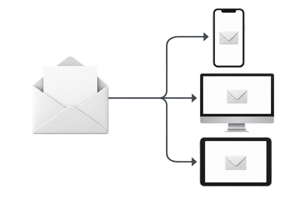
The templates in 12 email apps
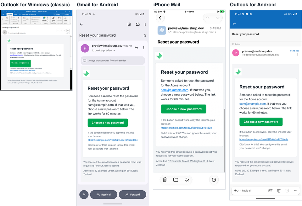
Password reset
The password reset email has one job: get the reader to a new password quickly. The button is the main path. The plain link underneath is there for apps or security tools that rewrite or disable buttons.
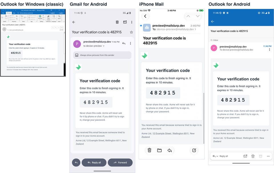
Verification code
Codes are easier to read and type when each digit stands apart, so the template sets the code in a monospaced font with wide letter spacing on a light grey panel. Every app we tested showed the six digits clearly. Classic Outlook for Windows ignored the letter spacing, so the digits sat closer together there.
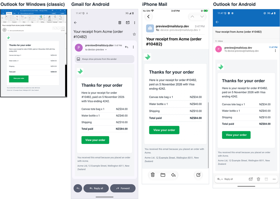
Receipt
The receipt uses a simple two-column table for line items, with the total in bold. Tables are the one layout tool every email app agrees on, so the prices lined up in all 12 apps.
Welcome and team invite
The welcome and team invite templates use the same building blocks as the password reset: a single card, a short block of details and one button. Download them from the table above.
Why these templates hold up
Each template uses techniques that our email client support tests showed work across the apps people actually use. If you adapt them, keep these in place.
One fluid column
The content is width: 100% with max-width: 600px, so it fills a phone screen at a normal text size and stops growing on a desktop. A fixed-width table inside an [if mso] comment, which only classic Outlook reads, keeps classic Outlook at 600px, because it ignores max-width.
Inline styles for everything that matters
The Gmail apps reading IMAP accounts drop <style> blocks entirely, so colours, sizes and spacing are written inline on each element. The small <style> block in each template only adds extras, such as dark-mode tweaks.
A button that doesn't depend on CSS support
The button is a padded link in a coloured table cell, with a VML version for classic Outlook. It showed in all 12 apps. In classic Outlook the corners came out square, because the cell's own background fills the space behind the rounded VML shape. Remove the cell background if rounded corners matter there.
Arial with a fallback
Every font stack ends in sans-serif, because a missing font with no fallback turned into a serif on Apple devices in our default font tests.
A hidden preheader
A short hidden line at the top sets the preview text that appears next to the subject in the inbox list, so readers see something useful before they open the email.
A dark-mode hint
The color-scheme meta tag and a small prefers-color-scheme rule darken the card in apps that support it. The logo is a mark without dark lettering, so it stays visible on a dark background.
Things we noticed in the screenshots
iPhone Mail adds its own links
iPhone Mail underlined the street address and the date in the receipt and turned them into links, because it detects addresses and dates automatically. If that matters for your design, test it on an iPhone.
Gmail on the web drops the page background
Gmail on the web didn't show the grey page background, only the white card. The templates still read well without it.
Classic Outlook squares the buttons
As described above, the button corners came out square in classic Outlook.
Testing your version
Once you have added your logo, colours and wording, test the email your app actually sends, not the file you edited. Template variables, link tracking and your email provider can all change the HTML on the way out.
Check the content in your automated tests
Send the email to a test inbox from your sign-up or reset flow, then assert on the subject, the code and the link. That catches a broken reset link long before a customer does. The email templates testing guide shows the workflow.
Check the rendering on devices
Send the same email to a device preview and compare the screenshots, especially classic Outlook and the Gmail app.
Check the size
Gmail clips messages over about 102 KB of HTML; each of these templates is under 6 KB. The Gmail clipping guide has the measured limit.
Frequently asked questions
Can I use these templates in a commercial product?
Yes. They are free to download, change and use. Replace the placeholder logo, company name and links with your own.
Do these templates work in dark mode?
They stay readable in dark mode. The page and card colours change in apps that recolour emails, and the logo has no dark lettering that could disappear. See how Gmail dark mode changes your email colours for what each app does.
Why tables instead of divs?
Classic Outlook for Windows renders email with Microsoft Word's layout engine, which handles tables reliably and ignores most CSS layout. Tables are still the safest structure for an email that must look right in every app.
Which email apps did you test?
Apple Mail on Mac, iPhone and iPad; Gmail on the web, Android and iPhone; classic and new Outlook for Windows; Outlook on the web, iPhone and Android; and Yahoo Mail on the web.