










MJML, React Email, Maizzle and Foundation for Emails: the same email tested on 12 apps (2026)
One order email built in MJML, React Email, Maizzle and Foundation for Emails and rendered on 12 email apps. See what stacked on phones and broke in Outlook.
Use with your tools
Hand-coding HTML email is a particular kind of tedious. Tables inside tables inside tables, inline styles on every element, special blocks for classic Outlook. Email frameworks exist so you don't have to do that by hand: you write something tidier, such as MJML tags, React components or Tailwind-style classes, and the framework turns it into the old-fashioned HTML email apps need.
They mostly deliver on that promise. But each framework makes its own choices about how to build columns, buttons and mobile layouts, and those choices show up in specific email apps, usually the awkward ones. If you are choosing a framework, or wondering why your framework's output looks odd in one app, those differences are the useful part.
So we built the same email in four popular frameworks and sent all four to 12 email apps. This guide shows what happened, explains why, and suggests which framework fits which kind of team.
How we compared the frameworks
The email
We built one order confirmation email: a logo, a heading, a paragraph, a button, two columns (a delivery address and an order summary) that should stack on phones, and a footer. It is deliberately ordinary, the kind of email every product sends.
The four frameworks
We built the email in MJML, React Email, Maizzle and Foundation for Emails. Each version uses the framework's own components, written the way its documentation shows, and we changed nothing in the HTML each one produced. That way the results reflect the framework's defaults, not our tweaks.
The apps
We sent all four versions to 12 email apps, including five phone apps: iPhone Mail, Outlook for iOS and Android, and the Gmail apps for iPhone and Android reading non-Google mailboxes (connected over IMAP). These results are from our November 2026 tests.
Opening four versions of an email in 12 apps by hand is a lot of sending and screenshotting. We used MailSlurp, an email testing platform, to send each version and capture every app automatically.
How automated device rendering works
Choose the devices and email services you want to test, and MailSlurp gives you a special email address. Send your campaign to that address. MailSlurp opens the email in the selected apps and webmail services, then captures screenshots automatically.
The screenshots come back together, ready to compare across phones, tablets and computers. Check the layout, images and buttons, then share a result link so your team can review the same version of the email.
The results at a glance
All four frameworks produced an email that worked on desktop and in webmail: Apple Mail on Mac and iPad, new Outlook for Windows, Outlook on the web, Gmail on the web and Yahoo Mail. The differences were on phones and in classic Outlook for Windows.
| Framework (version) | Columns stacked on phones (5 phone apps) | Classic Outlook for Windows | Output size |
|---|---|---|---|
| MJML 4.18 | 5 of 5 | Correct | 13.6 KB |
| Maizzle 6.3 | 4 of 5 | Text in the two columns was clipped | 6.3 KB |
| Foundation for Emails 2.5 (Inky) | 3 of 5 | Correct | 25.6 KB |
| React Email 6.11 | 0 of 5 (columns stayed side by side) | Correct | 4.3 KB |
Columns on phones
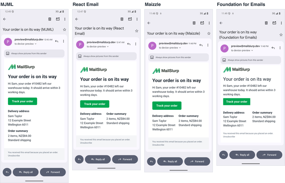
The biggest difference was what happened to the two columns on a narrow screen. Most frameworks stack columns with a media query, a CSS rule that only applies on small screens. The Gmail apps reading IMAP accounts throw away the email's <style> block, media queries included, so a layout that only stacks through a media query stays side by side there.
In the Gmail app for Android
How each framework handled the columns
- MJML stacked the columns in all five phone apps, including the Gmail apps. Its output is mobile-first: each column is full width by default, and a media query places them side by side on wider screens. An app that ignores the media query gets the phone layout, which is the safe direction to fail.
- Maizzle stacked everywhere except the Gmail app for Android. We used its
sm:responsive classes, which compile to a media query. - Foundation for Emails stacked on iPhone Mail and the Outlook apps, which apply its media queries, but not in either Gmail app.
- React Email's
RowandColumncomponents produced a fixed two-column table with no media query, so the columns stayed side by side on every phone. They were still readable at this width; with longer content they would be cramped.
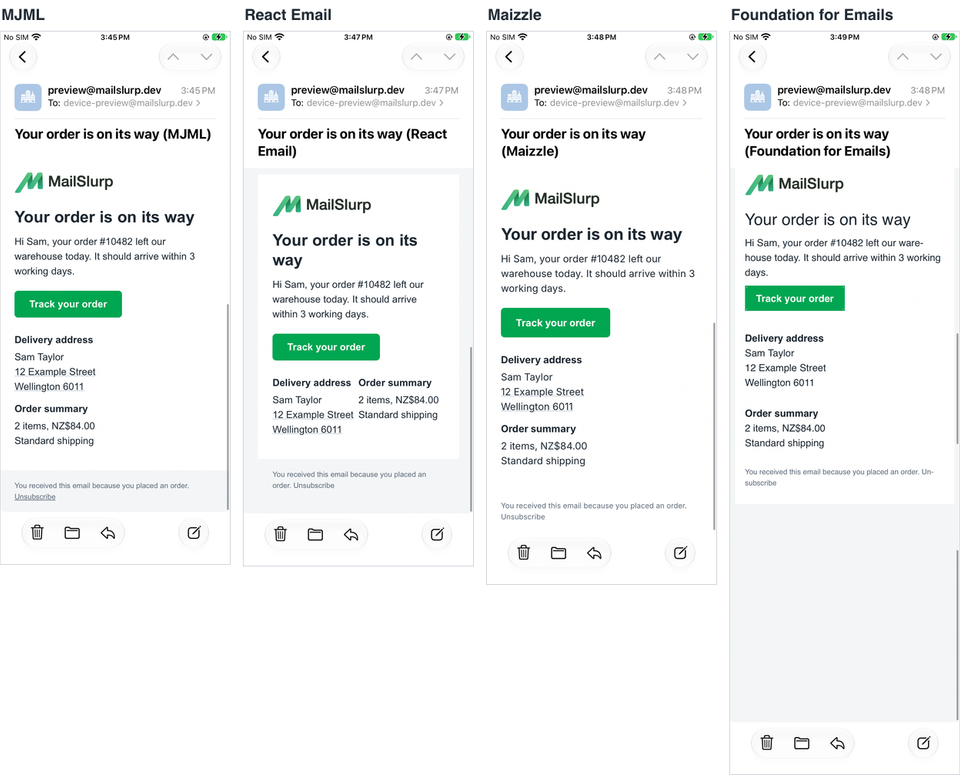
On iPhone Mail
On iPhone Mail, which applies media queries, three of the four stacked:
Classic Outlook for Windows
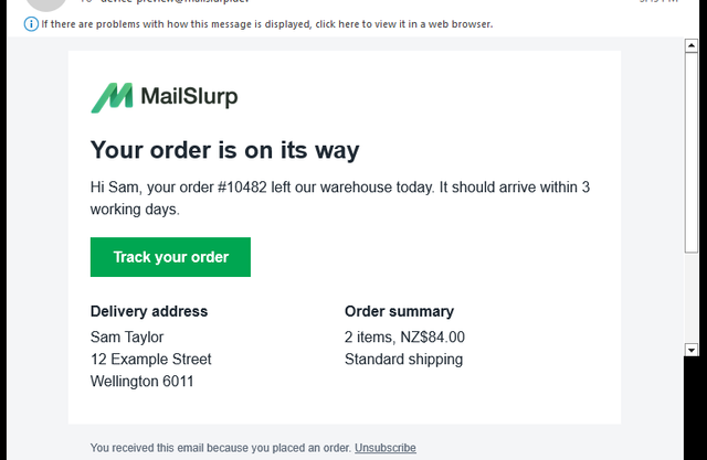
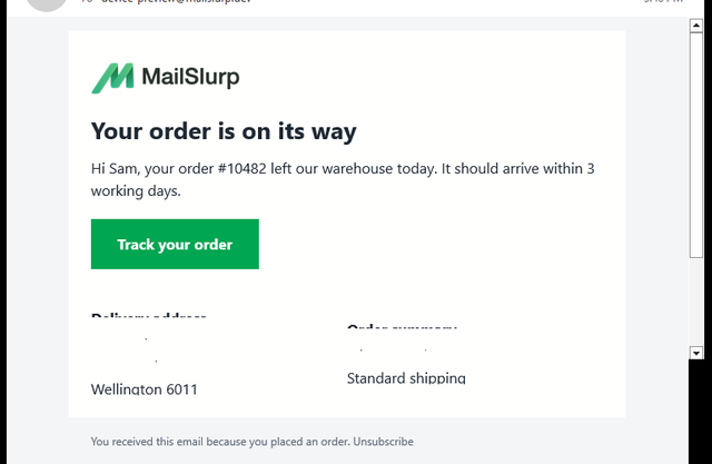
Three of the four looked right in classic Outlook. The Maizzle version lost most of the text in its two columns: only the last line of each block was visible.
MJML in classic Outlook
Maizzle in classic Outlook
Why the Maizzle columns were clipped
We didn't isolate the cause. Maizzle's Row and Column output wraps the columns in an inline-block layout with font-size: 0, and our text sat in paragraphs with line breaks rather than in table cells. If you use Maizzle, test multi-line text inside columns in classic Outlook before you send.
Other differences
Foundation for Emails hyphenates words
Its stylesheet turns on automatic hyphenation, and iPhone Mail and the Outlook mobile apps broke words such as "ware-house" across lines. Override hyphens if you don't want that.
Output size varied by six times
Foundation's output was the largest because its CSS is inlined into every element. All four are far below Gmail's clipping limit of about 102 KB, but the gap matters for long newsletters; see the Gmail clipping guide.
Buttons worked everywhere
All four frameworks' buttons displayed as buttons in all 12 apps. Classic Outlook showed square corners for every framework, because it ignores border-radius.
Which framework should you use?
There is no single winner. Pick the one that fits how your team already builds, then test its output. From this test:
If phone readers on the Gmail app matter most
MJML's columns were the only ones that stacked in the Gmail apps reading work or Outlook.com accounts without any extra help. Its mobile-first approach fails in the safe direction.
If you build in React
React Email produced the smallest, cleanest HTML. Plan for phones yourself, for example with a single-column layout or your own responsive classes.
If you like Tailwind-style classes
Maizzle is the natural fit. Check columns with multi-line text in classic Outlook before you send.
If you already use Foundation for Emails
It handled classic Outlook well. Check hyphenation and the Gmail apps.
The email client support hub has the underlying CSS results for each app, which explain most of these differences.
What this comparison doesn't include
We also tried Bootstrap Email, which is a Ruby gem. Its current version needs Ruby 3.2 or newer and we couldn't build it in our setup, so it isn't included here.
Each framework has more than one way to build a layout. We used each one's standard components and documented responsive approach; a different component choice can give different results. Download the sources and outputs to check our work or try your own:
- Sources: MJML, React Email, Maizzle and Foundation for Emails (Inky)
- Compiled HTML: MJML, React Email, Maizzle and Foundation for Emails
Frequently asked questions
Does MJML work in Outlook?
Yes. Our MJML email was correct in classic Outlook for Windows, new Outlook, Outlook on the web and the Outlook mobile apps.
Does React Email support Outlook?
Yes. The React Email version rendered correctly in all four Outlook apps we tested. Its two columns didn't stack on phones.
Is MJML better than React Email?
Not in every way. In our test, MJML handled phone layouts best, and React Email produced HTML a third of the size. Both worked in Outlook.