










Which email apps support media queries? Responsive email tested on 12 apps (2026)
Do Gmail, Outlook, Apple Mail and Yahoo apply @media rules for responsive email? Results from a test email on 12 email apps, with screenshots.
Use with your tools
A large share of email is opened on phones, so most email designs need to adapt to a narrow screen. Two columns that look tidy on a laptop become cramped at phone width, and text that reads comfortably on a monitor turns into squinting territory on a small screen.
The standard fix is a media query: a CSS rule that only applies when the screen is narrower (or wider) than a size you choose. Email designers use them to stack side-by-side columns, enlarge text and make buttons easier to tap on phones. When an email app ignores the media query, the reader simply gets the desktop layout squeezed onto their phone.
So which apps apply them? This guide shows the results from 12 email apps, explains why the three that ignored our media query ignored it, and covers how to build an email that still reads well when media queries don't apply.
What a media query does in an email
A rule with a condition
A media query wraps ordinary CSS rules in a condition. This one says "when the screen is 600 pixels wide or less, make each column full width":
@media screen and (max-width: 600px) {
  .column { display: block !important; width: 100% !important; }
}
Media queries live in a <style> block in the email's <head>. They can't be written inline on an element, which is why they depend on the email app keeping your <style> block in the first place.
Two ways an app can ignore one
An app can keep the <style> block but skip the media query inside it, or it can throw away the whole <style> block, media queries included. We saw both in our tests.
How we tested media queries
The test email
We sent the same CSS test email to 12 email apps. One of its lines is styled only by a media query: it turns green when the app applies the rule and stays red when it doesn't. The same email also tests whether each app keeps <style> blocks at all, and whether it applies a width limit (max-width) written directly on an element.
Reading the results
Our media query used a condition that always matches, so a green line means the app applies media queries at all. It doesn't test how each app measures the screen width. These results are from our November 2026 tests.
The screenshots come from MailSlurp, an email testing platform that sends one email to all 12 apps and captures each of them, including the phones where the difference shows.
How automated device rendering works
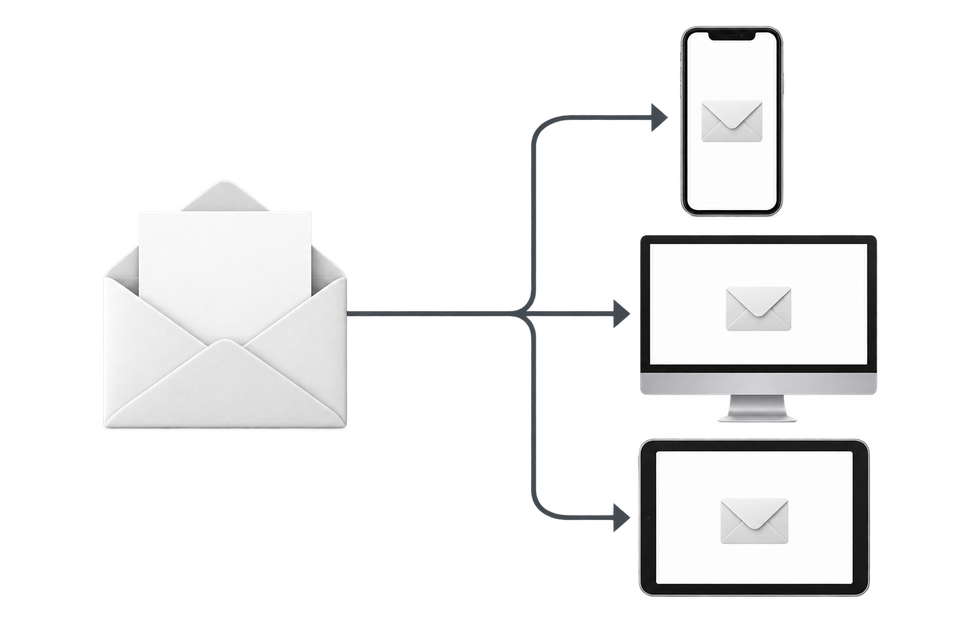
Choose the devices and email services you want to test, and MailSlurp gives you a special email address. Send your campaign to that address. MailSlurp opens the email in the selected apps and webmail services, then captures screenshots automatically.
The screenshots come back together, ready to compare across phones, tablets and computers. Check the layout, images and buttons, then share a result link so your team can review the same version of the email.
Which email apps support media queries
Nine of the 12 apps applied our media query. Three didn't, and showed the email's default layout on every screen size.
| Email app | @media query |
<style> blocks |
Inline max-width |
|---|---|---|---|
| Apple Mail (macOS) | Yes | Yes | Yes |
| Apple Mail (iPhone) | Yes | Yes | Yes |
| Apple Mail (iPad) | Yes | Yes | Yes |
| New Outlook for Windows | Yes | Yes | Yes |
| Classic Outlook for Windows | No | Yes | No |
| Outlook on the web | Yes | Yes | Yes |
| Outlook for Android | Yes | Yes | Yes |
| Outlook for iOS | Yes | Yes | Yes |
| Gmail (web) | Yes | Yes | Yes |
| Gmail for Android (IMAP account) | No | No | Yes |
| Gmail for iOS (IMAP account) | No | No | Yes |
| Yahoo Mail (web) | Yes | Yes | Yes |
The Gmail apps with non-Google accounts
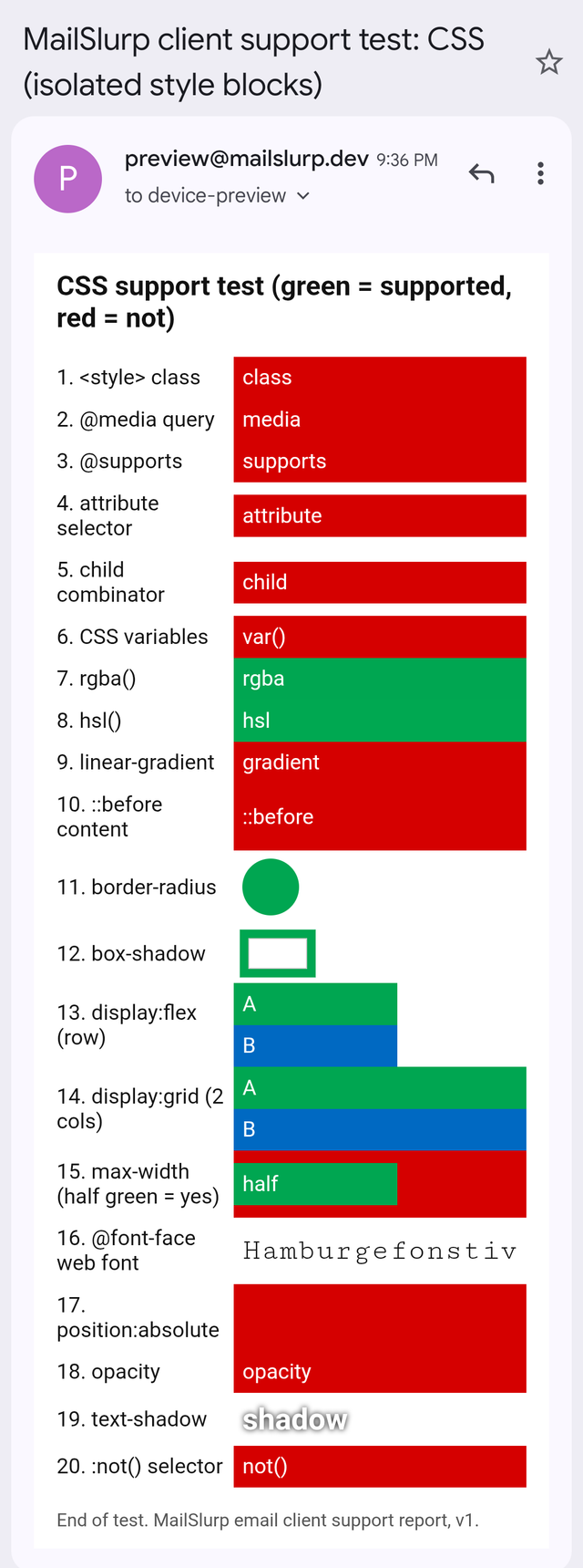
The Gmail apps for Android and iPhone, reading a non-Google mailbox such as Outlook.com or Yahoo (connected over IMAP), removed every <style> block. The media query never reached them. This is the result with the biggest practical impact, because these are phone apps: exactly where a responsive layout matters most.
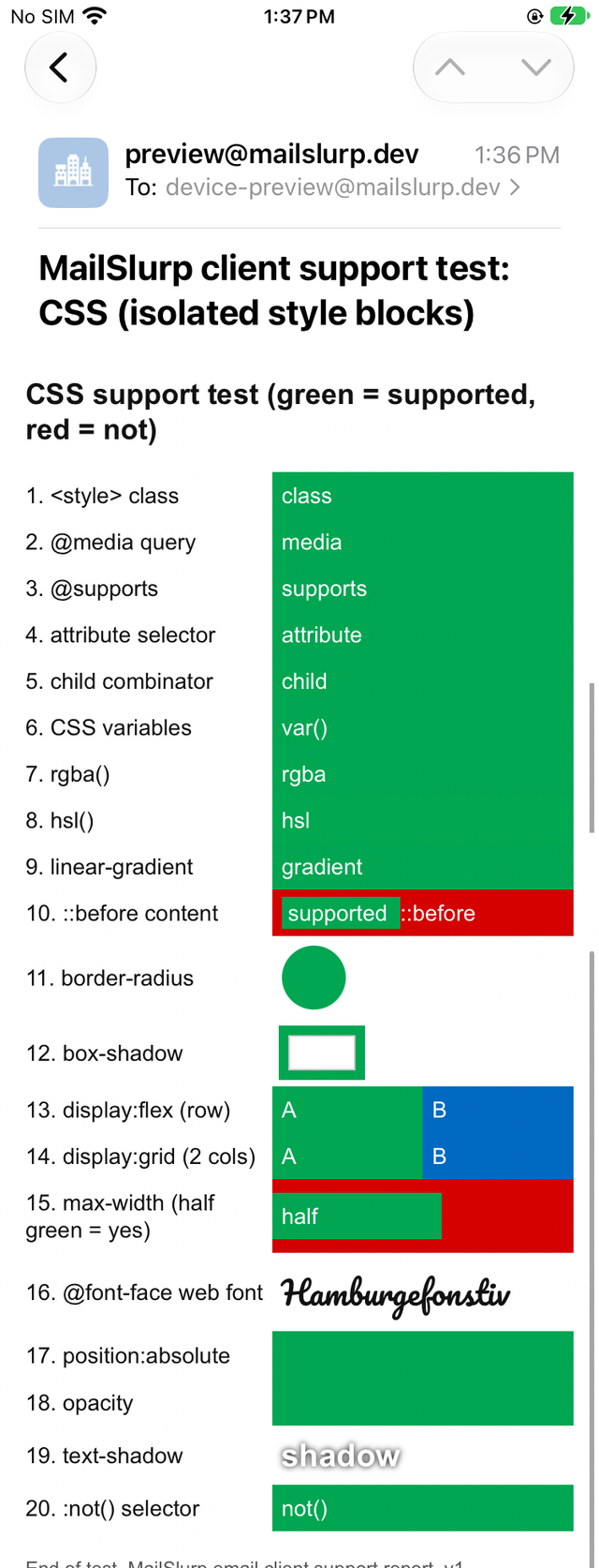
Here is the CSS test email on iPhone Mail and in the Gmail app for Android with an IMAP account. The second line is the media query.
Apple Mail (iPhone)
Gmail for Android (IMAP account)
Classic Outlook for Windows
Classic Outlook kept the <style> block but ignored the @media rule inside it. It also ignored max-width. Because classic Outlook runs on desktop screens, this matters less for phones, but it means your desktop layout has to be under control without help from CSS widths.
How to build for the apps that ignore media queries
Make the default layout work on a phone
Design the version without media queries so it already reads well at phone width: a single column, or columns narrow enough to stay readable side by side. Then use the media query to improve larger screens, rather than to rescue small ones. If the media query is dropped, the reader still gets something usable.
Put critical sizes inline
The Gmail apps with IMAP accounts applied inline styles, including max-width. A table with a percentage width and an inline max-width won't overflow the screen even when no <style> rule applies:
<table role="presentation" width="100%" style="max-width:600px;">
Give classic Outlook a fixed width
Classic Outlook ignored both the media query and max-width. A fixed-width table inside an [if mso] block, which only classic Outlook reads, keeps the desktop layout from stretching across a wide window.
Use columns that wrap without media queries
Columns built from inline blocks with a maximum width wrap on their own when the screen gets too narrow, no media query required. Our tested code patterns include one that worked in all 12 apps.
Keep text readable by default
Without a media query, 14px body text stays 14px on the phone. Start with a comfortable size, 16px is a common choice, rather than relying on a media query to enlarge it.
How wide the email should be is a separate question; the email design size guide covers widths for phones and desktop.
What these tests don't cover
- Gmail apps signed in to a Google account. Our Gmail app test devices read IMAP accounts.
- Breakpoints. Our test used a rule that always matches, so it shows whether an app applies media queries at all, not how it measures the screen width.
The full results are in the November 2026 report, and the test email is free to download from the email client support hub.
Frequently asked questions
Does Gmail support media queries?
Gmail on the web applied our media query. The Gmail apps for Android and iOS reading IMAP accounts ignored it, along with every other <style> rule.
Does Outlook support media queries?
New Outlook for Windows, Outlook on the web and the Outlook mobile apps applied our media query. Classic Outlook for Windows ignored it.
Should I still use media queries in email?
Yes. 9 of the 12 apps we tested applied them. Just make sure the email still reads well where they don't apply.