









Do gradients, shadows and rounded corners work in email? Tested on 12 apps (2026)
Which email apps support linear-gradient, box-shadow, text-shadow, border-radius and opacity? Results from a test email on 12 email apps, with screenshots.
Use with your tools
Rounded buttons, soft shadows under cards and gradient banners are everywhere in web design, so it is natural to reach for them when you design an email. They make an email feel modern and a little more polished. The catch is that in email, each app decides for itself whether to draw them.
When an app ignores one of these effects, it doesn't tell you. It simply draws whatever is underneath. A rounded button becomes square. A white card on a white page loses its only visible edge. White text that was meant to sit on a gradient sits on nothing at all, which on a white page means it disappears.
This guide shows which of 12 email apps drew each effect in our tests and, more usefully, how to use these effects so the fallback still looks intended.
The effects we tested
What each one does
- Rounded corners (
border-radius) curve the corners of a box, a button or an image. - Gradients (
linear-gradient) blend one colour into another across a background. - Box shadows (
box-shadow) draw a shadow or a glow around a box. - Text shadows (
text-shadow) draw a shadow behind text, often to make it readable over an image. rgba()colours add transparency to a colour, andopacitymakes a whole element see-through.
How we wrote them
We wrote each effect directly on its element, as an inline style, rather than in a <style> block. That way the results reflect the effect itself, not whether the app kept the email's stylesheet, which some apps throw away.
How we tested them
The test email
We sent the same CSS test email to 12 email apps. Each effect has its own line, drawn on top of a red block: if the app applies the effect, the line looks as intended; if it doesn't, the red shows through. These results are from our November 2026 tests.
We used MailSlurp, an email testing platform, to send the test and capture all 12 apps side by side, which is the quickest way to see each fallback.
How automated device rendering works
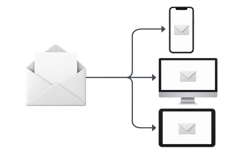
Choose the devices and email services you want to test, and MailSlurp gives you a special email address. Send your campaign to that address. MailSlurp opens the email in the selected apps and webmail services, then captures screenshots automatically.
The screenshots come back together, ready to compare across phones, tablets and computers. Check the layout, images and buttons, then share a result link so your team can review the same version of the email.
Which apps support gradients, shadows and rounded corners
Rounded corners were reliable: every app except classic Outlook for Windows drew them. Gradients and shadows were much patchier. A gradient worked in 6 of the 12 apps, a box shadow in 9 and a text shadow in 7. Classic Outlook ignored every one of these effects.
| Email app | linear-gradient |
border-radius |
box-shadow |
text-shadow |
rgba() |
opacity |
|---|---|---|---|---|---|---|
| Apple Mail (macOS) | Yes | Yes | Yes | Yes | Yes | Yes |
| Apple Mail (iPhone) | Yes | Yes | Yes | Yes | Yes | Yes |
| Apple Mail (iPad) | Yes | Yes | Yes | Yes | Yes | Yes |
| New Outlook for Windows | Yes | Yes | Yes | Yes | Yes | Yes |
| Classic Outlook for Windows | No | No | No | No | No | No |
| Outlook on the web | No | Yes | Yes | No | Yes | Yes |
| Outlook for Android | No | Yes | Yes | No | Yes | Yes |
| Outlook for iOS | No | Yes | Yes | No | Yes | Yes |
| Gmail (web) | Yes | Yes | No | No | Yes | Yes |
| Gmail for Android (IMAP account) | No | Yes | Yes | Yes | Yes | No |
| Gmail for iOS (IMAP account) | Yes | Yes | Yes | Yes | Yes | No |
| Yahoo Mail (web) | No | Yes | No | Yes | Yes | Yes |
Seeing the difference
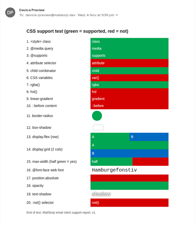
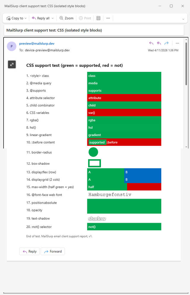
Here is the same test email in Yahoo Mail and new Outlook for Windows. Look for the gradient bar, the round shape (rounded corners) and the ring around the next shape (the box shadow).
Yahoo Mail (web)
New Outlook for Windows
How to use these effects safely
The rule of thumb is simple: use these effects as decoration, never as the only thing holding a design together. Here is what that means for each one.
Gradients: always set a solid colour first
Six apps ignored our gradient. If the gradient sits behind white text, those readers need a background colour that still makes the text readable. Set a solid background-color before the gradient; apps that understand the gradient draw it on top, and the rest show the solid colour:
<td style="background-color:#0069c2; background-image:linear-gradient(#1d8cf0,#0069c2); color:#ffffff;">
  Spring sale ends Friday
</td>
Pick the solid colour from the darker end of the gradient so the text keeps its contrast.
Rounded corners: fine almost everywhere
Only classic Outlook showed square corners. For most emails that is perfectly acceptable. If rounded buttons really matter to your brand in classic Outlook, draw them with VML, Microsoft's vector format that classic Outlook still understands; the bulletproof email buttons guide shows how.
Shadows: don't rely on them to separate content
Gmail on the web, Yahoo and classic Outlook dropped box-shadow. A white card on a white page with only a shadow to define it becomes invisible there. Use a thin border or a light background colour instead, both of which every app draws.
Text shadows: don't use them for readability
Five apps ignored text-shadow. If you are relying on a shadow to make white text readable over a photo, those readers lose it. Put the text on a solid or darkened area of the image instead.
Opacity: never use it to hide content
Classic Outlook and the Gmail apps with IMAP accounts ignored opacity: 0, and our hidden red block appeared. If something must stay hidden in some apps, opacity is not the way to do it.
Colours: prefer hex or rgba() over hsl()
hsl() colours failed in five apps, while rgba() worked everywhere except classic Outlook. Six-digit hex values work in all 12.
What these tests don't cover
- Radial gradients and background images layered with gradients. Our test used one
linear-gradient. - Dark mode. Some apps change colours in dark mode, which can affect gradients; see how Gmail dark mode changes your email colours.
The full results are in the November 2026 report, and the test email is free to download from the email client support hub.
Frequently asked questions
Does Outlook support border-radius?
Every Outlook we tested applied border-radius except classic Outlook for Windows.
Do CSS gradients work in Gmail?
Gmail on the web and the Gmail app for iOS applied our gradient. The Gmail app for Android didn't.
Does box-shadow work in email?
In 9 of the 12 apps we tested. Classic Outlook, Gmail on the web and Yahoo Mail ignored it.