










HTML email signatures in Outlook, Gmail and Apple Mail: what changes (tested 2026)
Why HTML email signatures look different in Outlook, Gmail and dark mode. Three signature styles rendered on 12 email apps, with screenshots.
Use with your tools
An email signature is a strange little piece of design. You build it once, look at it in your own email app, decide it looks great, and then it goes out on every message you send, to people using every email app there is. You never see most of those versions.
That is why signature problems tend to go unnoticed for months. A logo that looks sharp in your own Outlook can disappear on a colleague's phone in dark mode. A carefully cropped round headshot can arrive as a square. A phone number you styled in your brand colour can turn into a bright blue link you didn't ask for.
This guide shows what happened to three common styles of HTML signature in 12 email apps, and what to change so yours looks the way you designed it wherever it lands.
Why signatures look different in other people's email
Your view is the only one you see
Your signature only ever looks one way to you: in your own app, on your own device, usually in light mode. Everyone else sees it through their app's handling of HTML, which can differ in fonts, shapes, colours and links.
Signatures use the fragile parts of HTML email
Signatures tend to rely on exactly the features email apps disagree about: transparent logos, rounded photos, small icons and precise spacing. They are also often built by pasting HTML into an app's settings, where it can be rewritten before it is ever sent.
How we tested signatures
Three signatures in one reply
To see what happens to a signature on its way to other people's inboxes, we wrote a short reply email with three common styles of HTML signature underneath:
- Signature A: name, title and links in paragraphs, with a transparent PNG logo that has dark lettering.
- Signature B: a table with a round photo, a coloured divider and two small icons, one SVG and one PNG.
- Signature C: the whole signature as one image.
Which apps we checked
We sent the reply to 12 email apps, and to the three apps we can capture in dark mode: Gmail for Android, Gmail on the web and Outlook for Android. These results are from our November 2026 tests.
You can't see any of this from your own email app, because your signature only ever looks one way to you. We used MailSlurp, an email testing platform, to send the reply and capture it in every app automatically.
How automated device rendering works
Choose the devices and email services you want to test, and MailSlurp gives you a special email address. Send your campaign to that address. MailSlurp opens the email in the selected apps and webmail services, then captures screenshots automatically.
The screenshots come back together, ready to compare across phones, tablets and computers. Check the layout, images and buttons, then share a result link so your team can review the same version of the email.
What we found
Every app showed all three signatures with their images. Three things changed the way they looked:
- Dark mode hid the dark lettering in the logo. In Gmail for Android and Outlook for Android dark mode, the word "MailSlurp" in our transparent logo almost disappeared against the dark background.
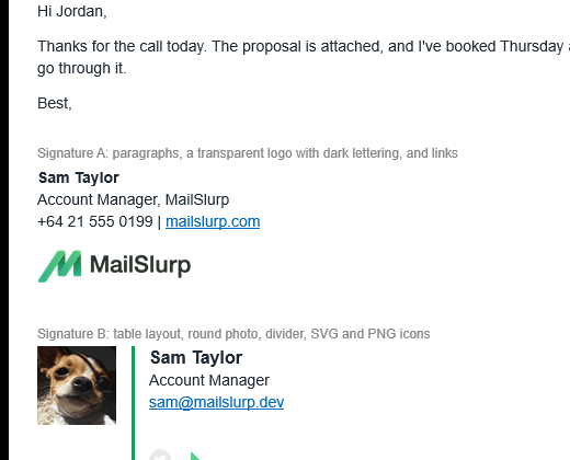
- Classic Outlook for Windows showed the round photo as a square, because it ignores
border-radius. - Some apps turned the phone number into a link. Gmail on the web and Outlook for Android made it blue, and iPhone Mail underlined it.
The sections below look at each one and how to fix it.
Logos in dark mode
What happened to the logo
This was the most visible change in our test. A transparent PNG logo with dark lettering is invisible on a dark background, and Gmail and Outlook for Android both put one behind it when the phone is in dark mode.
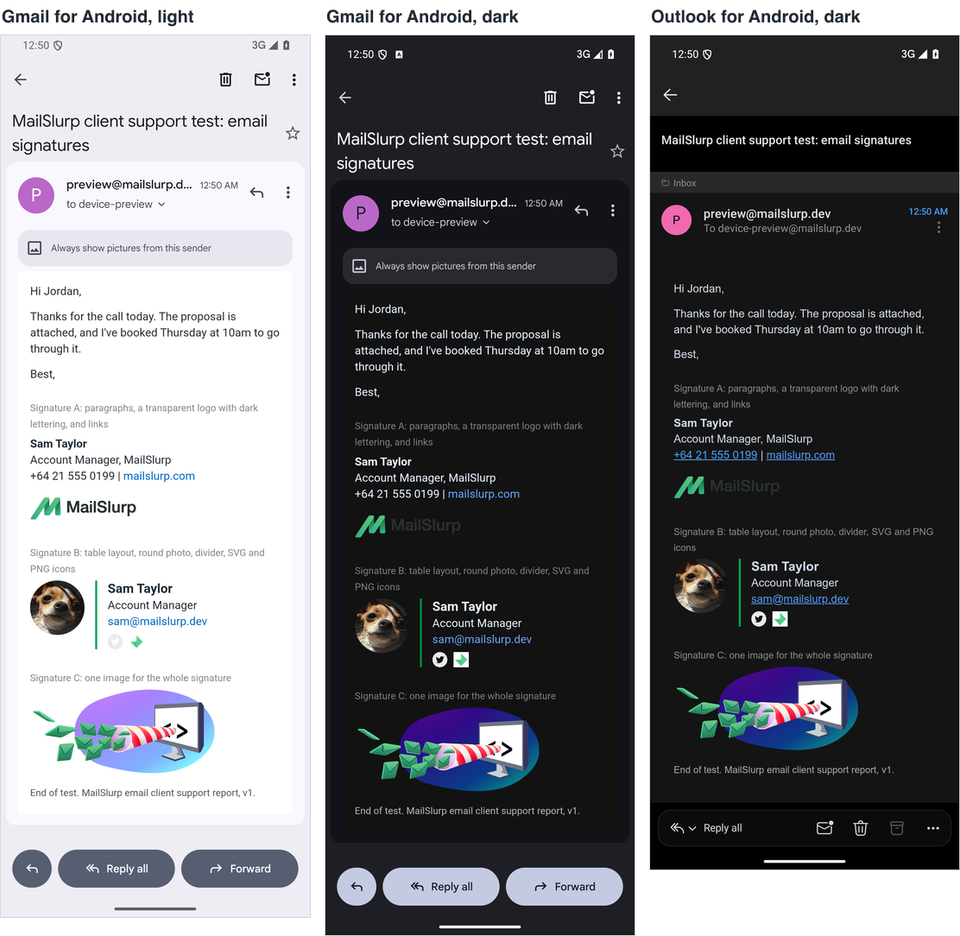
Gmail on the web didn't recolour the email in its dark theme, so the logo looked the same there as in light mode. The dark mode colour map shows how each Android app changes colours.
How to keep the logo visible
The fix is in the image, not the code. Pick one:
- Give the logo a solid white or light background with a little padding, so it stays readable on any background.
- Add a thin light outline around dark lettering.
- Use a version of the logo without dark lettering, such as a mark on its own.
Round photos and layout in classic Outlook
What happened to the photo
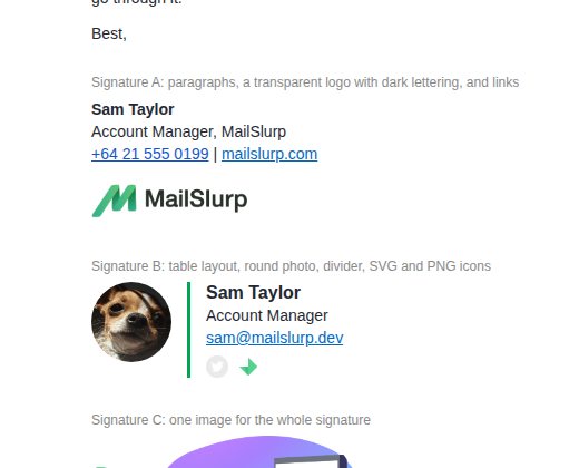
Classic Outlook for Windows kept the signature table, the green divider and the icons, but showed the photo as a square.
Outlook for Windows (classic)
Gmail (web)
How to keep the photo round
If the round shape matters, crop the photo into a circle in the image file itself, on a white background, rather than relying on border-radius. Then it looks the same in every app, classic Outlook included.
Phone numbers, dates and addresses that turn into links
What happened to the phone number
Gmail on the web and Outlook for Android turned our phone number into a blue, tappable link, even though the signature didn't link it, and iPhone Mail underlined it. iPhone Mail also underlined "Thursday at 10am" in the message body. Apps do this to be helpful, and readers often like it, but it can clash with your signature colours.
How to keep control of the links
Link the number yourself with a tel: link styled the way you want. Then the number is a link you designed rather than one the app added. We didn't test this version, so check it in the apps your contacts use:
<a href="tel:+6491234567" style="color:#0b1f3a; text-decoration:none;">+64 9 123 4567</a>
Image-only signatures
What happened to the image signature
Signature C, a single image, looked identical everywhere in our test, because every app loaded images.
Why we still don't recommend it
That screenshot hides the real risks. When a reader's app blocks images, the whole signature disappears, and the contact details can't be copied or read by a screen reader. If you use one anyway, put the name and phone number in the image's alt text and keep a text version of the key details next to it.
What these tests don't cover
- Signatures added by the email app itself. We placed the signature HTML in the email. Outlook and Gmail can rewrite signatures you paste into their settings.
- Images blocked. Our test devices load images.
- Dark mode on Outlook for Windows and iPhone. So far we have measured dark mode on Gmail for Android, Gmail on the web and Outlook for Android.
The test email is free to download. For animated signatures, see how to add an animated email signature, and for more results by app, the email client support hub.
Frequently asked questions
Why does my email signature look different in Outlook?
Classic Outlook for Windows ignores much of the CSS signatures use, such as border-radius, so round photos and rounded buttons become square. Spacing and fonts can also change. Test the signature in the Outlook versions your contacts use.
Why does my logo disappear in dark mode?
The logo is probably a transparent PNG with dark lettering. In dark mode, apps such as Gmail and Outlook for Android put a dark background behind it. Give the logo a light background or use a version without dark lettering.
Should I use SVG icons in an email signature?
Our SVG icon displayed in all 12 apps when linked as an image. PNG is still the safer choice, because some email programs and signature tools convert or strip SVG.