
guides
Dark Mode Email Testing for Gmail, Outlook, and Apple Mail
Learn how to test dark mode email behavior, prevent contrast and logo failures, and ship templates that remain readable across major clients.
Use with your tools
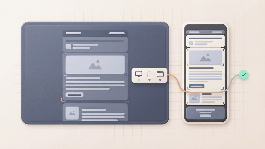
A logo that looks crisp on white can disappear against a dark background. Dark mode email testing checks whether your text, buttons, logos and borders stay visible when each app changes colors or applies its dark-theme styles.
To check a revision by hand, you'd need to open the same email in each relevant app, switch appearance settings and collect the screenshots.
MailSlurp is an email testing platform with automated device previews. It captures the message in selected email clients so you can compare its appearance and share the results with the team approving the send.
Quick answer
A production-ready dark mode test should verify:
- text and background contrast
- CTA button visibility and hover/focus states
- logo and icon treatment under inversion
- divider, border, and table-line visibility
- fallback behavior in clients with partial CSS support
Why dark mode breaks email differently by client
Email clients do not implement dark mode consistently:
- some force-invert most colors
- some partially invert with heuristics
- some honor declared dark-mode styles only in specific elements
Compare light and dark results for each app you need to support. Check the email itself as well as the surrounding inbox: a dark mailbox interface does not tell you which message colors have changed.
How automated device rendering works
Choose the devices and email services you want to test, and MailSlurp gives you a special email address. Send your campaign to that address. MailSlurp opens the email in the selected apps and webmail services, then captures screenshots automatically.
The screenshots come back together, ready to compare across phones, tablets and computers. Check the layout, images and buttons, then share a result link so your team can review the same version of the email.
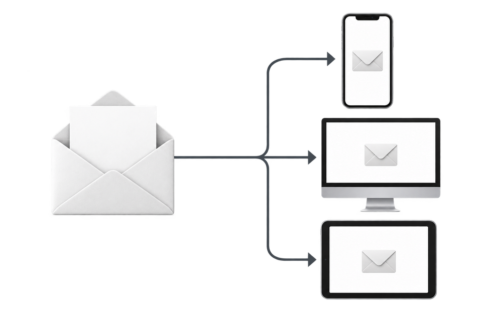
Choose the clients and appearances to compare
Use your audience's email clients to choose the test set. Keep these checks separate so a result from one app is not mistaken for coverage of another:
| Client group | Comparisons to include | Elements to inspect |
|---|---|---|
| Gmail | Browser and relevant mobile apps, with supported light and dark appearances | Body text, links, and button fill/border |
| Outlook | The desktop, web, and mobile versions your audience uses | Table backgrounds, separators, and text colors |
| Apple Mail | Relevant iPhone/iPad and Mac targets | Declared dark-mode styles, transparent logos, and buttons |
These are review priorities, not a guarantee that every version applies the same color changes.
Dark mode email testing checklist
1) Baseline contrast checks
Use the email light and dark preview tool for a first pass on your HTML's prefers-color-scheme styles. It shows two browser CSS previews; follow that check with device previews to inspect Gmail, Outlook, and other clients' own color transformations.
- verify primary text against every major background block
- test secondary text, disclaimers, and footer links
- confirm disabled states remain readable
2) CTA safety checks
- validate button text-to-background contrast
- verify button border survives inversion
- ensure text links still look clickable when colors shift
3) Asset and logo checks
- test transparent PNG/SVG assets against dark backgrounds
- provide alternate assets for inversion-prone logos
- verify social icons stay legible at mobile sizes
4) Structural visibility checks
- test card boundaries and table separators
- check bullet/number list markers
- confirm hero/background overlays do not hide copy
5) Fallback-content checks
- test plain-text alternatives for critical flows
- validate safe defaults when dark-mode CSS is ignored
- assert legal and compliance blocks remain readable
Implementation guidance for engineering teams
- Add dark-mode templates to your core release matrix, not optional QA.
- Store known-problem components (buttons, cards, badges) as reusable patterns.
- Run CI assertions on message content and structure using Email Sandbox API.
- Pair rendering checks with Email feature compatibility table and Email client testing.
- Gate release when dark-mode critical components fail.
Common anti-patterns
- relying on white text without verifying forced inversion outcomes
- shipping dark logos without fallback for transparent backgrounds
- testing only one provider/client before production send
- treating dark-mode checks as campaign-only instead of transactional-critical
Related guides and tools
- Dark mode email preview
- Device previews
- Free email render
- Email client testing
- Email testing tools
- Email testing ideas
- Email compatibility tester
- Email testing checklist
Retest the corrected email
After changing a color, button, or logo, send the revised email through the same light and dark checks. Compare the affected elements in both appearances before approving that version; a fix for dark mode still needs to remain readable in light mode.