
blog
How to Test Emails on iPhone and Android Before Sending
Send a finished campaign to iOS Mail, Gmail iOS, Gmail Android, and Outlook mobile previews. Catch layout, image, CTA, and dark-mode problems before launch.
Your campaign can look tidy in a narrow browser preview and still break after it reaches a phone. The delivered message includes your email service provider's (ESP's) final HTML, tracked links, hosted images, personalization, footer, and unsubscribe content. The mail app then decides how to display it.
Test the finished email in the mobile clients your audience uses before scheduling the full send. That gives your designer a specific failure to fix, not a vague note that "mobile looks wrong."
A mobile browser preview is the first check, not the last
The mobile view in your ESP is useful while you build. It quickly reveals a wide layout, an awkward content order, or a CTA that starts too far down the message.
A delivered-email preview answers a different question: what did Gmail, Outlook, or Apple Mail display after the ESP assembled and sent the campaign? That check can expose:
- columns stacking in the wrong order
- images clipping, stretching, or loading at the wrong size
- a headline wrapping into an unreadable block
- a CTA losing contrast or moving below less important content
- long personalization values widening the layout
- footer and unsubscribe text becoming difficult to use
- dark mode hiding a logo, button, or secondary text
Use both views. Build with the ESP preview, then approve from the delivered result.
Choose a small, relevant mobile client list
"iPhone" and "Android" are devices or operating systems, not single email clients. An iPhone user may open the message in iOS Mail, Gmail iOS, or Outlook iOS. An Android user may use Gmail Android or Outlook Android. Those paths should not be collapsed into one generic phone screenshot.
Start with audience evidence if you have it. For a practical campaign review, select a focused set such as:
| Audience path | MailSlurp target to include | What to compare |
|---|---|---|
| iPhone users in Apple's mail app | iOS Mail | Width, stacking, image scaling, CTA, and dark mode where supported |
| iPhone users in Gmail | Gmail iOS | Gmail-specific layout and color treatment |
| iPhone users in Outlook | Outlook iOS | Layout, images and action visibility |
| Android users in Gmail | Gmail Android | Mobile stacking, image loading, CTA, and light/dark variants |
| Android users in Outlook | Outlook Android | Outlook mobile layout, links, and dark-mode contrast |
Choose dark-mode variants only when they appear in the current target picker. A light iPhone capture does not stand in for a separate dark-mode run.
Add a desktop or webmail target when the same approval should protect both phone and office users. A compact, representative set is easier to review carefully than a large grid nobody finishes.
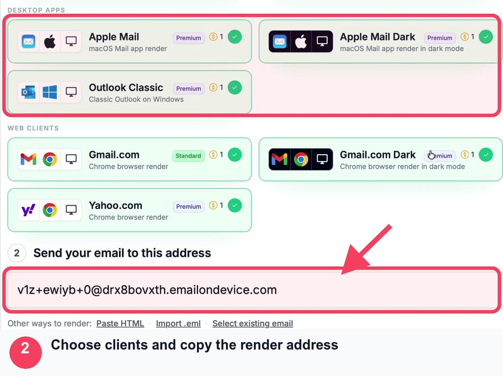
Send the finished Mailchimp campaign to the render address
The same handoff works for many ESPs: create a render, copy its address, and send the final campaign test to that address. Mailchimp provides a clear example.
- Open Device Previews in MailSlurp and start a new render.
- Select the iOS and Android clients that matter to the audience.
- Copy the complete render address from the active run.
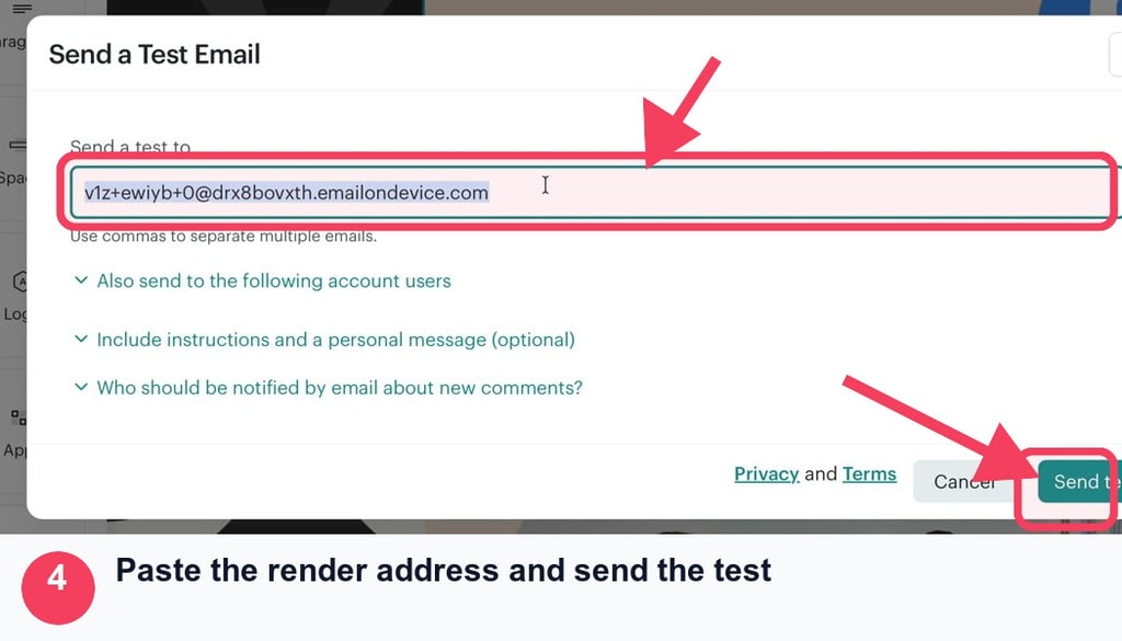
- Open the finished Mailchimp campaign and choose Send a Test Email.
- Paste the MailSlurp address and send.
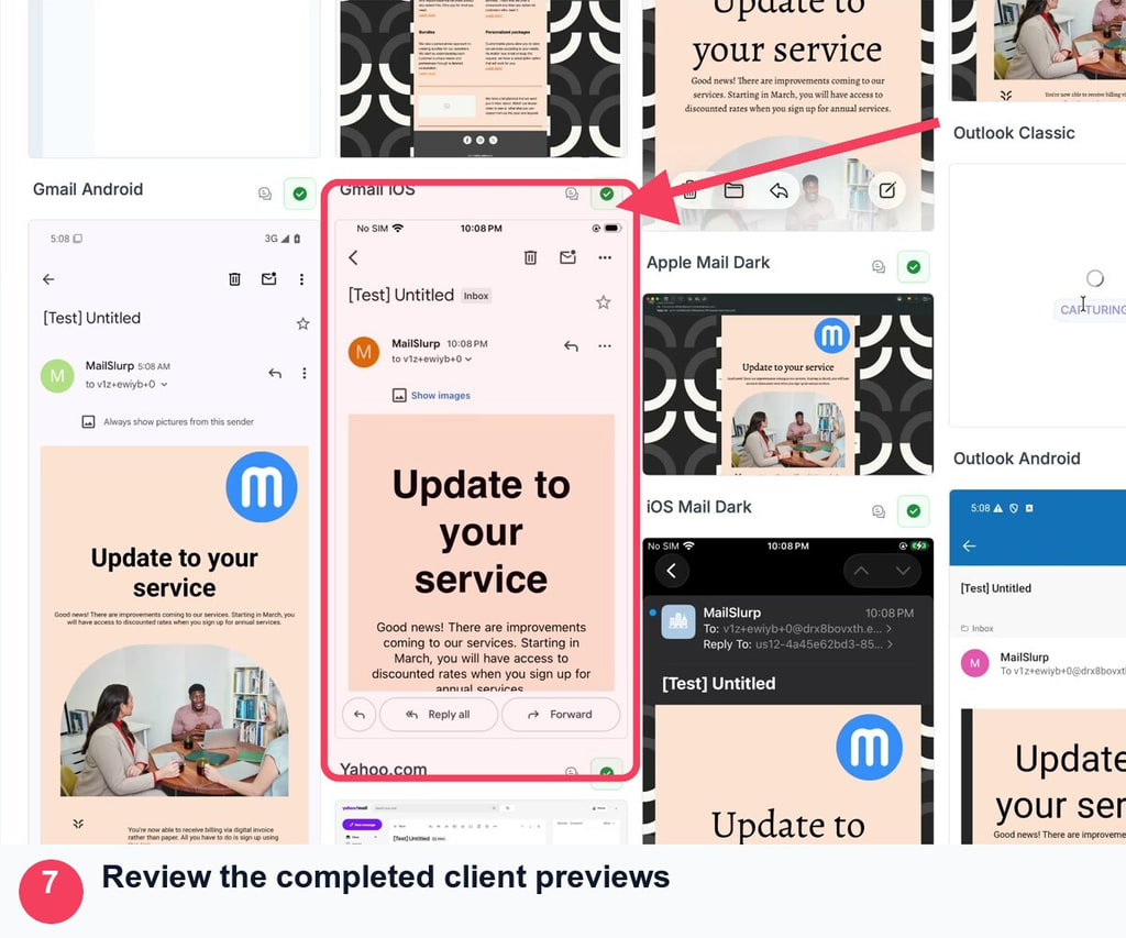
- Return to MailSlurp, open the detected message, and wait for the selected results to become ready.
- Review the mobile captures at full size and compare two clients when the difference matters.
Mailchimp documents an important test-email limitation: contact-specific merge tags and dynamic content do not work in an ordinary test email. If the mobile layout depends on a first name, product block, conditional offer, or another contact field, use Mailchimp's live merge-tag preview or send a controlled live campaign to a small test segment. Do not approve an empty placeholder that customers will never receive.
For the complete provider walkthrough, follow Mailchimp device rendering. HubSpot and Klaviyo teams can use the corresponding HubSpot rendering guide or Klaviyo rendering guide.
Check the five parts that decide whether the email works
1. Readable text
Read the email at its normal capture size. Check the subject, preheader, headline, body, offer terms, legal copy, and unsubscribe content. The reader should not need to zoom or rotate the phone to understand the message.
Look at the actual words, not only font size. A long headline, URL, discount code, or personalized value can break a layout that worked with shorter placeholder text.
2. Logos and campaign images
Confirm that every image loads, uses the intended crop, and stays inside the message width. A missing image needs useful alternative text. A logo should remain recognizable without occupying most of the first screen.
If one app shows the wrong image size, record the client name and capture. That is more useful to a designer than a generic request to "make images responsive."
3. Column stacking and reading order
A desktop row may become a vertical sequence on mobile. Read that sequence from top to bottom. Product image, heading, explanation, price, and CTA should still appear in a sensible order.
Pay special attention to alternating desktop layouts. If every second row reverses visually on desktop, the mobile source order may produce copy-copy-image-image rather than a useful item-by-item sequence.
4. The offer and important conditions
The customer should be able to see what is offered, who it applies to, and any important date or condition without hunting through the message. Check that a large hero image or navigation block has not pushed the useful promise too far down.
5. A usable CTA
The primary action should look like an action, contain legible text, and point to the correct destination. Open it from the received message in a safe test environment. A rendering capture proves visibility; it does not prove the landing page, login, coupon, or checkout works.
Avoid inventing one universal pixel threshold for every campaign. Judge whether the action is clear and practical in each selected client, then follow your organization's accessibility and design requirements.
Why your two-column email will not stack on a phone
When two product blocks stay side by side, inspect their layout rule before blaming the phone. A narrow preview can reveal the symptom without explaining why it happens.
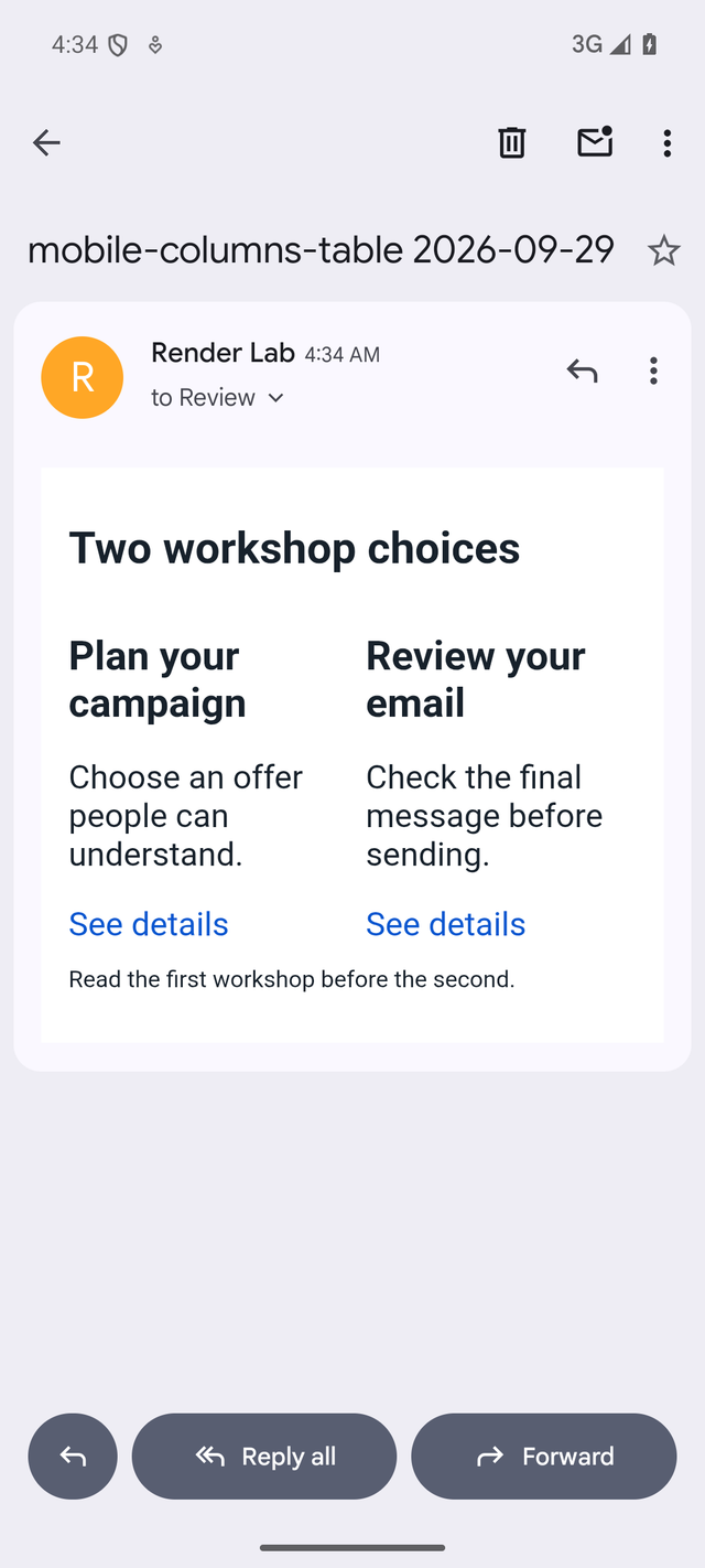
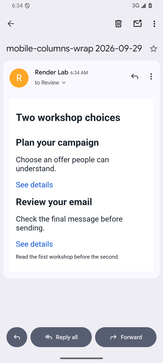
We isolated one cause in a September 29, 2026 MailSlurp test. Two 280-pixel workshop blocks contained the same headings, descriptions and links. The first email told the blocks to behave as table cells. The second changed their display rule to inline blocks, which could wrap when there was not room for both. The content and width requests stayed the same.
In Gmail Android and iPhone Mail, the table-cell version kept both workshops beside each other. The wrapping version placed the second workshop underneath the first.
Before: columns stay together
After: each workshop gets its own row
These were controlled imported emails, not Mailchimp sends. The table-cell example and wrapping example are available as saved EML messages. This small comparison does not establish desktop compatibility for a complete template.
For your own campaign, ask the designer to inspect three constraints: the outer email width, the fixed width of each block or image, and the rule that permits columns to stack. Change one constraint at a time and rerender the same target. Also check the source order: the heading, description and action for the first item should stay together before the second item begins.
A responsive email may use media queries, which apply layout rules at selected widths. Google documents Gmail support for width-based media queries. A failed campaign therefore does not justify the general claim that Gmail ignores them. Inspect the received HTML, the specific rule and any changes introduced by the ESP.
If the editor stacks the blocks but the delivered email does not, give the designer both versions and the exact client capture. If both fail, start with the template itself. After the mobile repair, rerun an important desktop target so the new stacking behavior does not damage the wider design.
Compare light and dark mode where supported
Do not assume that a passing light-mode capture proves dark mode. Mail clients may leave colors unchanged, invert only parts of the email, or transform the message more extensively.
Compare:
- logo visibility against the transformed background
- body and secondary-text contrast
- button fill, label, and border
- links and dividers
- image-contained text
- screenshots or product images with a fixed light background
If a logo or CTA becomes hard to see, use the dark mode email preview guide to separate image, text, and button fixes. Rerun the exact affected target after the change.
Fix, resend, and share the approved version
One screenshot should lead to one actionable note. Include:
- campaign and revision
- exact client target, such as Gmail Android or iOS Mail
- light or dark mode
- screenshot of the affected section
- expected appearance
- observed problem
- change made
- revised render link
For example: "Gmail Android dark: the footer logo blends into the background. Replace it with the approved high-contrast asset and rerun Gmail Android light and dark." That gives the designer a target, symptom, and acceptance check.
Use this sign-off list for the revised campaign:
- The final ESP revision was sent, not an earlier draft.
- Every required mobile target completed.
- Text is readable without zooming.
- Images load and fit the message width.
- Columns stack in a useful reading order.
- The offer and primary CTA are easy to find.
- Light and dark mode remain legible where selected.
- Footer, preferences, and unsubscribe content work.
- The render was repeated after the last material edit.
Frequently asked questions
Is a mobile preview in my ESP enough?
It is useful while editing, but the delivered email adds the ESP's final markup, tracking, images, personalization, and footer before a mail client renders it. Use a delivered-client preview for approval.
Which iPhone email app should I test?
Choose the apps your audience uses. Common targets include iOS Mail, Gmail iOS, and Outlook iOS. An iPhone label alone does not identify the rendering path.
Which Android email app should I test?
Gmail Android and Outlook Android are useful named targets. Include the one supported by your audience data and campaign risk.
Does a test email show Mailchimp personalization?
Not all of it. Mailchimp says contact-specific merge tags and dynamic content do not work in ordinary test emails. Use live merge-tag preview data or a controlled live test segment when personalization affects approval.
Approve what customers will actually receive
Start with the editor, but finish with the delivered message. A focused iOS and Android target set lets you catch the break, hand back a precise change, and approve the corrected campaign with evidence.