
guides
Your Email Font Changed: How to Fix Wrapping and Fallbacks
Test what happens when a campaign uses its fallback font. Compare real Gmail, Outlook and Apple Mail results, then repair crowded headings, prices and buttons.
The headline fitted yesterday. Today a colleague opens the campaign in Outlook and the last word falls onto a third line. Nothing in the copy changed, but the email may be using a different font.
An email font fallback is the next typeface the template asks for when its preferred font is unavailable. To fix the resulting layout, compare the same content at the same width, choose a usable fallback, and give headings and buttons enough room for the changed text. The aim is a readable campaign even when the exact brand font is absent.
Find the font request before changing the design
Ask your designer for the font stack: the ordered list of fonts in the template. It might request a brand font first, then Arial, then a general sans-serif font. A hosted web font adds another dependency because the receiving app must be able and willing to load it.
Litmus' web-font guide explains the difference between hosted fonts and common system fallbacks. A font that works on your website is not enough evidence to approve its email version.
For a campaign diagnosis, collect the received message and a capture of the affected heading. Note whether the problem affects every text block or only one. A changed font throughout the message suggests a different investigation from a single block with an accidental style override.
A screenshot can show a changed letter shape or line break. It cannot always prove the exact installed font that rendered the text. Keep the source's requested font separate from the visible result.
A controlled fallback comparison
On September 29, 2026, we imported an email with two 260-pixel text areas into MailSlurp. Both requested a deliberately unavailable brand-font name. One then requested Arial and sans-serif; the other requested Georgia and serif. There was no downloadable web font in this test.
The heading, date, price and link wording stayed the same. We compared Gmail web, Outlook Classic and Apple Mail on macOS.
| Visible check | Gmail web | Outlook Classic | Apple Mail macOS |
|---|---|---|---|
| Heading in Arial-requested sample | Two lines | Two lines | Two lines |
| Heading in Georgia-requested sample | Two lines | Two lines | Two lines |
| Date and price in Arial-requested sample | Two lines | Two lines | Two lines |
| Date and price in Georgia-requested sample | One line | Two lines | Two lines |
The heading did not break in this example. The date and price did change their line count in Gmail. That is useful: checking only the largest text would have missed the difference.
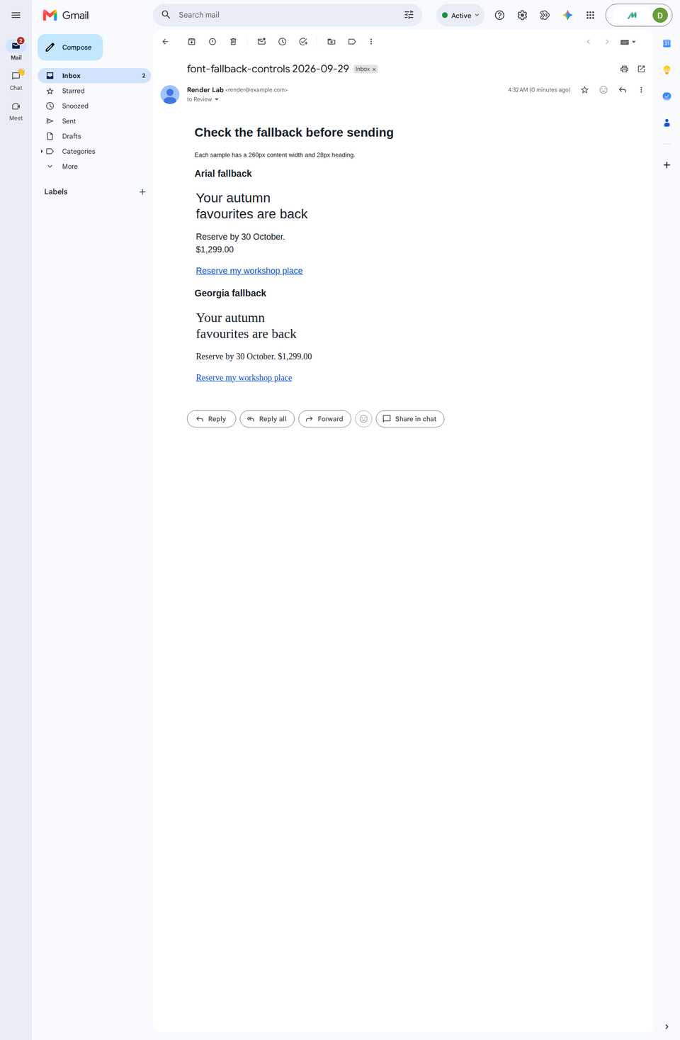
The downloadable fallback test is a saved EML message. Your designer can substitute your own headline, long price and action label before running a similar comparison. For choosing candidate fonts in the first place, see our email font selection guide.
Compare more than the headline
Start with the words that carry the campaign. A font change can alter character width, line height and the apparent weight of a button label. Look closely at:
- a long product or event name
- prices with currency symbols and thousands separators
- dates and expiry conditions
- a personalised greeting with a long name
- the full primary button label
- small footer and preference text
Read the whole phrase in context. A price on its own line may be perfectly clear, while a deadline separated from its condition can be confusing. Decide what counts as a real defect before asking the designer to reproduce an exact line break everywhere.
For a multilingual campaign, test the actual translation. The shorter English heading is not a reliable stand-in for a longer localized version.
Repair the constraint that makes the fallback fragile
If the fallback is wider, first consider giving the text more space or allowing another line. A headline does not need to fit a fixed-height box merely because the original design did. A button should accommodate its complete label without cropping.
If the typeface itself feels wrong, ask for a fallback with more comparable proportions and weight. Test the complete stack again rather than swapping a name and assuming the new font is present everywhere.
Shorten copy when the shorter version is also clearer. Avoid shrinking all text until the worst case fits: you may repair one line break by making the entire message harder to read. Converting essential text into an image introduces a different failure, covered in the missing-image guide.
For a template developer, a useful request is: "This headline must remain fully visible with the fallback, and the button must show the complete label." That states the reader's need while leaving room for a robust implementation.
Retest the delivered campaign
Make the change in a duplicate template, then send the finished campaign through the same provider. A HubSpot marketing email should be checked after HubSpot has assembled its final content; use the HubSpot device-rendering guide to send it to MailSlurp.
Compare the originally affected client first. Then check a phone-width target and another important desktop client. Count the lines in the problem area, look for clipping, and read the offer and action at their normal size.
Keep a long-content example in the reusable template's test set. That makes the next review more useful than repeating a short placeholder headline. When the fallback is readable and the action is clear, the campaign can keep its character without depending on one particular font being available.